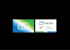
Design a youthful and inspiring logo + stationary for a new company in the communication and travel branch

Start date: 25-02-2015

Ending date: 08-03-2015

Total budget: € 299.00
Latest design
Book cover
studio1962

It all started with an idea...

A short, interactive guide helped them discover their design style and clearly captured what they needed.

Needs


The logo / stationary should visualise a company being expert in bringing people and businesses together. The logo should have the option to display various branches or sections of the company that provide different services. The company is based in the caribbean but will be operating worldwide. Although youthful is a must in the logo, the customer must feel experience and professionalism when seeing the brand.


Company description


Make My Day is a new company that will focus on bringing together people and businesses in various branches. The company will have excellent tools and options to make people's lives better and help businesses grow.

Target group


marketing/communication people
travellers
explorers

Colors, favourites and other requirements


Make sure this logo is easy to print, embroid, etc. Would like to see orange and/or blue and/or mint green. Please stay away from yellow. Use bright large letters. In the stationary, avoid using large coloured area's to ensure print costs are kept to a minimum.
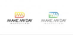
Also the logo needs to have the ability to get a branche name below:
Ex. Make my day marketing or Make my day communications ,.. etc.

Required:
- Logo
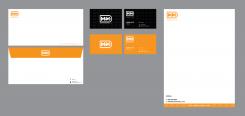
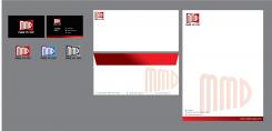
- Stationary (letterhead, business card, invoice, envelope)

Winning designer may also receive new assignments once portfolio needs to be extended.

Designer: jijie0307 jijie0307
logo-jijie0307-XYUasjhI

No comments

This contest is finished. Its not possible to reply anymore.
logo-jijie0307-dJXpfuGu

No comments

This contest is finished. Its not possible to reply anymore.
logo-jijie0307-JXMhvpmi

No comments

This contest is finished. Its not possible to reply anymore.
logo-jijie0307-7nJyeAOe

No comments

This contest is finished. Its not possible to reply anymore.
logo-jijie0307-7B0FqI0e

No comments

This contest is finished. Its not possible to reply anymore.
logo-jijie0307-2qmCD9Ga

No comments

This contest is finished. Its not possible to reply anymore.
logo-jijie0307-Cp3Q3Fgm

No comments

linanijmanlinanijman

Thanks. I think the green white and blue looks too tech and is missing some inspirational and creative expressions. Just wondering how the Icon can be used more clearly and still expresses the youthfulness of the company....

This contest is finished. Its not possible to reply anymore.
logo-jijie0307-CCjhFNIm

No comments

This contest is finished. Its not possible to reply anymore.
logo-jijie0307-S1JiJnua

No comments

This contest is finished. Its not possible to reply anymore.
logo-jijie0307-ROzzVvWa

No comments

linanijmanlinanijman

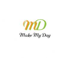
I like what you did with the letters to use as an icon. Can you work out this a bit more towards a clean logo (try to avoid using different colours in 1 word). Maybe you can look at more options in this category.

jijie0307jijie0307

thank you for the feedback... i will upload a new one..

:)

This contest is finished. Its not possible to reply anymore.