No comments
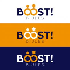
Design new logo for Boost tuttoring/bijles!!
- Contest holder: boostbijles
- Category: Logo design
- Status: Ended
Start date: 30-12-2015
Ending date: 03-02-2016
It all started with an idea...
A short, interactive guide helped them discover their design style and clearly captured what they needed.
Brandsupply is a platform where creative professionals and businesses collaborate on unique projects and designs.
Clients looking for a new logo or brand identity describe what they need. Designers can then participate in the project via Brandsupply by submitting one or more designs. In the end, the client chooses the design they like best.
Costs vary depending on the type of project — from €169 for a business or project name to €539 for a complete website. The client decides how much they want to pay for the entire project.
Dit lijkt erg op een vos. Dit is niet echt een kenmerk wat ik wil uitstralen omdat een uil meer het teken van wijsheid is bijvoorbeeld. Ik wil een strak logo die wijsheid uitstraalt en ziet waar we voor staan
Thank you for your feedback, attached two typo alternatives, in the previous color combination (darker blue) and the adjusted subline. lloking forward to your reply, kind regards
Good morning,
thank you for your rating, attached a new variation of my last proposal. Kind regards, Dagmar Lange
Morning! I like this indeed. I prefer the ----Bijles--- from your design before. Can you maybe show me some different letter types? This looks a bit too straight and easy. I like the color combination of the design before better. The darker blue
And a little less playful variation, kind regards
Good morning boostbijles,
thank you for your feedback. Attached a revision in a different color combination and without the exclamation mark, as requested. Looking forward to your reply, kind regards, Dagmar Lange
No comments
Ziet er leuk uit is alleen nog niet precies wat ik zoek. Het begin is goed maar zou je misschien met nog wat andere ideeën kunnen komen.
In English, I love the concept of the connecting o's, it perfectly shows what we want to do. I'm not really sold on the colors though. Also I don't think we need the exclamation mark after Boost. Anyhow good work and we look forward to seeing an updated design from you.
 Nederland
 België
 France
 Deutschland
 Österreich
 International
