No comments
Design of logo for local village festival
- Contest holder: sdelorge
- Category: Logo design
- Status: Ended
Start date: 30-04-2020
Ending date: 08-05-2020
It all started with an idea...
A short, interactive guide helped them discover their design style and clearly captured what they needed.
Brandsupply is a platform where creative professionals and businesses collaborate on unique projects and designs.
Clients looking for a new logo or brand identity describe what they need. Designers can then participate in the project via Brandsupply by submitting one or more designs. In the end, the client chooses the design they like best.
Costs vary depending on the type of project — from €169 for a business or project name to €539 for a complete website. The client decides how much they want to pay for the entire project.
No comments
Hi, if you need to see more let me know.
Regards
L
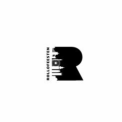
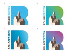
Can't you delete the shadow of the church?
Hei congrat you winer this contest with this design.
I think the client is using my logo without declaring me as the winner and not paying me and brandsupply
I think the client is using my logo without declaring me as the winner and not paying me and brandsupply
I think the client is using my logo without declaring me as the winner and not paying me and brandsupply
No comments
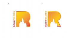
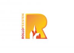
Can you rework this logo with brighter colours (red/ yellow/ orange)
Also the church without the shadow (black)
No comments
Previous design was better, altough the second R is also in the running.
Still in discussion with our group.
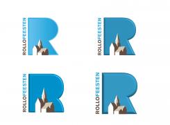
We want the logo more in 3D, is this possible
No comments
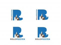
I can deliver you all kind of colors and type of "R"
after the end of the contest.
Best,
L
You are in the good way, colour is certainly something that can be changed quickly.
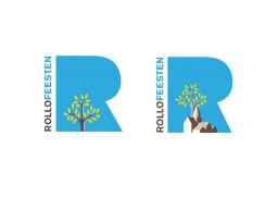
Can you once adapt the church in something else (tree,landscape of Church and tree)
No comments
Hello,
Thanks for your feedback.
Let me know if you wish any changes.
Best regards,
L
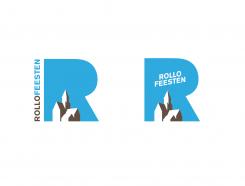
as previous mentioned the one with text on left side seems ok.
De R shoul be more attractive. The changes are less then first design
 Nederland
 België
 France
 Deutschland
 Österreich
 International
