Dear Mex,
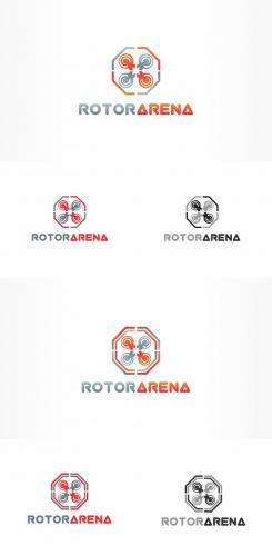
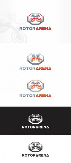
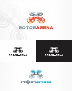
Thank you for feedback, yes the spirals was futher away from octagon cause perspective was removed, I made them now larger and closer, and I add black/grey colors version. Also I add another version of logo with another octagon , i try to make to look more like arena, maybe you like it more.
Best regards,
Misa84
Drone Race
- Contest holder: Mex
- Category: Logo design
- Status: Ended
Start date: 12-12-2016
Ending date: 19-12-2016
It all started with an idea...
A short, interactive guide helped them discover their design style and clearly captured what they needed.
Brandsupply is a platform where creative professionals and businesses collaborate on unique projects and designs.
Clients looking for a new logo or brand identity describe what they need. Designers can then participate in the project via Brandsupply by submitting one or more designs. In the end, the client chooses the design they like best.
Costs vary depending on the type of project — from €169 for a business or project name to €539 for a complete website. The client decides how much they want to pay for the entire project.
Dear Mex,
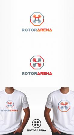
First logo is like the last one only without perspective as you like, i add a second one where sign is divided into 4 parts representing 4 pilots/drones.
Best regards,
Misa84
Dear Misa,
i really like that work, but my question is, in your first works the rotors were very colse from the octogon while in this one they look further and make them look tinier ?
but great work spliting the logo in 4, you anticipated my remark that is the kind of logo i can use for future races and giving each pilot his own part of the logo
could you try to make the rotors slightly bigger ?
regards
No comments
i like it ! could you try to make it a view from above and not in a perspective ? in the future i'd like to use my logo as a button/emblem. eager to see the result !
No comments
there is so much stuff i like in your work, the spiral helixes, the body of the drone, even though I imagined my logo b&w you chose great colours.
now as I told the other designers, I'd like the logo being in an octogon to make the people understand it is an arena where people compete.
if you can try to mix your work with that, I think you can make an awesome creation
Dear Mex,
Thank you for your comment and suggestions, i'll make a changes you want, what about a font - do you like more first or second one.
Best regards,
Misa84
 Nederland
 België
 France
 Deutschland
 Österreich
 International
