No comments
Elektim Projecten BV
- Contest holder: confusus
- Category: Logo design
- Status: Ended
- Files: File 1
Start date: 14-02-2018
Ending date: 28-02-2018
It all started with an idea...
A short, interactive guide helped them discover their design style and clearly captured what they needed.
Brandsupply is a platform where creative professionals and businesses collaborate on unique projects and designs.
Clients looking for a new logo or brand identity describe what they need. Designers can then participate in the project via Brandsupply by submitting one or more designs. In the end, the client chooses the design they like best.
Costs vary depending on the type of project — from €169 for a business or project name to €539 for a complete website. The client decides how much they want to pay for the entire project.
Dear confusus,
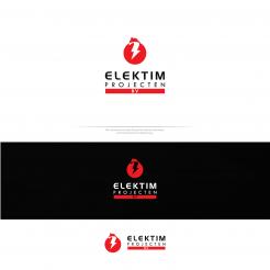
here is my first vision about your company.
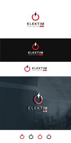
This logo is inspired by power:
- there are power button in the main view
- letter "e" in up (above) direction
- horse incorporated in one unique way with power (thunderbolt) symbol which together represents strength, power, one finished activity (circle) from your company
I really hope that you like it.
If you have some suggestion, please feel free to contact me.
All the best,
Marko
m3kdesign.wix.com/portfolio
Thank you for your submission! I really like the direction that you're going. I also like the horse; but it is not something we're looking for when representing the company.
 Nederland
 België
 France
 Deutschland
 Österreich
 International
