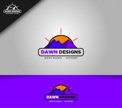
Hey! I made a purple version of this and I think this looks good too , What all changes do you think is possible?
Fresh clean logo for a female entrepreneur starting up a company in Joinery
- Contest holder: TDCrook
- Category: Logo design
- Status: Ended
Start date: 27-11-2020
Ending date: 18-12-2020
It all started with an idea...
A short, interactive guide helped them discover their design style and clearly captured what they needed.
Brandsupply is a platform where creative professionals and businesses collaborate on unique projects and designs.
Clients looking for a new logo or brand identity describe what they need. Designers can then participate in the project via Brandsupply by submitting one or more designs. In the end, the client chooses the design they like best.
Costs vary depending on the type of project — from €169 for a business or project name to €539 for a complete website. The client decides how much they want to pay for the entire project.
Hey! :D
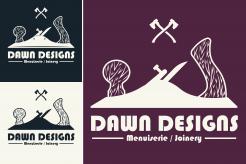
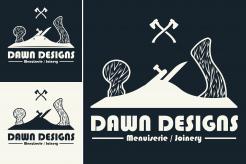
I like the shape of the logo, the idea of forming a triangle/mountain shape from the plane and the axes is nice. The axes though are a little out of place as although they are required to cut down the tree, that's not my job :D
Perhaps the axes could be replaced by a joiners set square? Or a couple of screw drivers or pencils?
Additionally, not a fan of the font on this one. Curvy fonts are not my thing.
Appreciate your time with your designs! :D
Look forward to any revisions you come up with.
Hey! Here is another design I came up with , This will stand out as the logo alone itself describing your work. Let me know how you liked this one. I will improve my designs with your decisions . Regards
Commented on the second design with purple :)
Hey greetings.
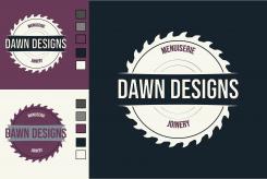
I designed this great circular blade logo , which will work with most colours that you mentioned. Let me know your views on it. Regards
Hi X4TeN designer!
It's great to see your designs, thank you for your time and work so far.
I love the colour combinations you have used, I actually had navy in my original specifications but removed it last minute, so its nice to see you chose it.
The overall impact of this design is strong. The teeth on the saw are perfect, well spaced to keep the design clean looking.
I like the navy logo the best, as it's better when we cannot see the centre part of the saw, the open space is nice.
Could I ask for you to lengthen the words "menuiserie" and "joinery"? Perhaps don't use a "narrow" font or space the letters more? They are a little squashed and hard to read. I decided today that I will also need to embroider the logo and this will be hard to do as it stands.
Thank you again, and I really hope to see version 2.
Kind regards,
Dawn Designs
 Nederland
 België
 France
 Deutschland
 Österreich
 International


