First of all, I loved teh Zeitgeist movies. I love the way they started a 'thinking process'.
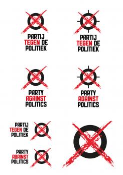
The idea for the logo is very basic, but with a strong expression. De circle stroke is also used in the logo of teh Venus project and there's also a subtle reference to the Anarchy logo. I think that's a fun thing.
Most of all, I think it's a logo that can be easily drawn by everyone. When you have a red and black pencil, or a brush and black and red paint, its easy to reproduce and spread. In my opinion, that could be an interesting side effect of a logo that needs people to identify with it and its purposes.
And of course it is also a reference to voting. Or meaby better said, a vote against voting.
Would like to know your thoughts!
Kind regards
Goal: Design a logo for a new, energetic and refreshing Dutch political party: Partij tegen de Politiek
- Contest holder: vickyvb
- Category: Logo design
- Status: Ended
- Files: File 1
Start date: 08-07-2015
Ending date: 02-09-2015
It all started with an idea...
A short, interactive guide helped them discover their design style and clearly captured what they needed.
Brandsupply is a platform where creative professionals and businesses collaborate on unique projects and designs.
Clients looking for a new logo or brand identity describe what they need. Designers can then participate in the project via Brandsupply by submitting one or more designs. In the end, the client chooses the design they like best.
Costs vary depending on the type of project — from €169 for a business or project name to €539 for a complete website. The client decides how much they want to pay for the entire project.
 Nederland
 België
 France
 Deutschland
 Österreich
 International

