Met de thumbs up!
IGGY
- Contest holder: IGGY
- Category: Logo design
- Status: Ended
Start date: 29-02-2012
Ending date: 30-03-2012
It all started with an idea...
A short, interactive guide helped them discover their design style and clearly captured what they needed.
Brandsupply is a platform where creative professionals and businesses collaborate on unique projects and designs.
Clients looking for a new logo or brand identity describe what they need. Designers can then participate in the project via Brandsupply by submitting one or more designs. In the end, the client chooses the design they like best.
Costs vary depending on the type of project — from €169 for a business or project name to €539 for a complete website. The client decides how much they want to pay for the entire project.
Zie ook commentaar bij mijn vorig ontwerp.
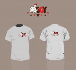
Here by i present to you another version with an example on a t-shirt. I placed the letters on a different place. Added some stars to add more rock n roll effect.
I hope you like the change :-)
Hi Iggy,
Can you tell me what you're thoughts are over the logo I created? What can be different? What are you missing?
Sincerely,
Ko-Lin Chang
Another version, other colors and no thumbs on the "Y".
thank you for your proposals
What do u think about the colors and the logo?
Any comments on it?
I like the colors. as the contest was launched today, we need to wait for the other proposals.
Thank you very much for all your suggestions
Beste Iggy,
Hierbij een eerste ontwerp vanuit schets. Ik vraag u daarom om feedback te geven op de vorm en het idee. Niet zozeer over de kwaliteit of kleurstelling, dit kan later nog altijd veranderd worden.
Ik hoor graag iets van u
MVG,
Graphicraven
thank you for your submission and fast proposal.
my first impression is that I can not quite read the brand name.
best regards,
Olivier
thank you for your submission and fast proposal.
my first impression is that I can not quite read the brand name.
best regards,
Olivier
maybe the name should be written in capital letters: IGGY
Thanks for the fast reaction! True, I can imagine you are not seeing the IGGY in it. Are you looking for a brandmark in the text or you leave this to the designer? This is no typeface, i created it.
I will brainstorm some more and how to include the logo in the text or maybe not.
Nice project to work on!
we put more information on the project description.
before we have the idea that the "i" IGGY is a thumbs up http://www.hellopro.fr/images/produit-2/8/4/7/pouce-1242748.png
why not leave the dot shape of the hand in the logo.
this brand will be rock n'rool :)
 Nederland
 België
 France
 Deutschland
 Österreich
 International


