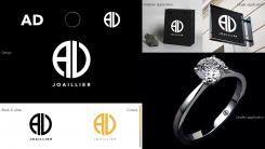
The monogram is inspired by the object with the simplest form of jewelry, the ring.
The monogram is the center of our brand with its solidity giving imposingness to the letters "A" and "D" that compose it.
The accompanying font was named by the creator "Avenir", a font which, together with the monogram, project us into the future.
Chromaticaly we have 2 colors. A gold that leads him to be even more refined. It's a
brown that gives it a touch of comfort and simplicity.
jewelry logo
- Contest holder: Astorc & Di bacco
- Category: Logo design
- Status: Ended
Start date: 27-05-2020
Ending date: 10-06-2020
It all started with an idea...
A short, interactive guide helped them discover their design style and clearly captured what they needed.
Brandsupply is a platform where creative professionals and businesses collaborate on unique projects and designs.
Clients looking for a new logo or brand identity describe what they need. Designers can then participate in the project via Brandsupply by submitting one or more designs. In the end, the client chooses the design they like best.
Costs vary depending on the type of project — from €169 for a business or project name to €539 for a complete website. The client decides how much they want to pay for the entire project.
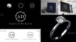
I studied a brand starting from a diamond, the pinnacle of luxury in the world of jewelry.
The monogram "A D" is enclosed in the diamond.
The font used for the monogram belongs to the Bodoni family, known for its elegant and very geometric curves. While for "Joaillier" I opted for a Baskerville, known by the designs for its readability and elegance.
Finally in the color version I opted for blue, which instills security, and gray for its sobriety and modernism.
 Nederland
 België
 France
 Deutschland
 Österreich
 International


