No comments
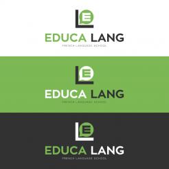
LOGO FOR A FRENCH LANGUAGE SCHOOL IN PARIS (french for foreigners): EDUCALANG
- Contest holder: Nicolas MOREAU
- Category: Logo design
- Status: Ended
Start date: 10-12-2015
Ending date: 08-01-2016
It all started with an idea...
A short, interactive guide helped them discover their design style and clearly captured what they needed.
Brandsupply is a platform where creative professionals and businesses collaborate on unique projects and designs.
Clients looking for a new logo or brand identity describe what they need. Designers can then participate in the project via Brandsupply by submitting one or more designs. In the end, the client chooses the design they like best.
Costs vary depending on the type of project — from €169 for a business or project name to €539 for a complete website. The client decides how much they want to pay for the entire project.
Hello Mr. Moreau,
attached a new version, maybe this one suits your expectations better, kind regards, D. Lange
No comments
Bonjour,
Merci de cette proposition. La combinaison de couleurs est très bonne (surtout fond gris / lettres vertes et blanches).
Il serait préférable de ne pas séparer Educalang en 2 mots.
Par ailleurs, pourriez-vous proposer une autre image au-dessus du nom? L'idée de faire apparaître les lettres E et L est bonne mais nous ne sommes pas convaincus par cette proposition.
Merci par avance.
Cordialement,
NM
Good morning,
I'm realizing that you might not understand French. Sorry about that. Here is the translation:
Thank you for this proposal. The color combination is very good (especially gray background / green and white letters).
It would be better not to separate Educalang in 2 words.
Also, could you suggest another image above the name? The idea to show the letters E and L is good but we are not really convinced by the proposal.
Thanks very much in advance.
Regards,
NM
Good morning NM,
thank you for your translation ;) Very kind, but I do speak french, not perfect, but enough to understand your feedback. I will think about another image sign and upload new peoposals soon.
Best regards, Dagmar Lange
ok, merci!
Regards,
Nicolas MOREAU
 Nederland
 België
 France
 Deutschland
 Österreich
 International
