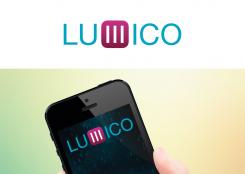
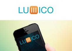
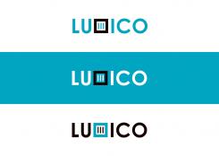
Two color propositions, and iOS7 style. I also have the iOS7 font in a thinner version, but for a logo I think that appears too skinny.
Logo for a new digital content marketing agency
- Contest holder: Willem Breytenbach
- Category: Logo design
- Status: Ended
Start date: 08-03-2014
Ending date: 22-03-2014
It all started with an idea...
A short, interactive guide helped them discover their design style and clearly captured what they needed.
Brandsupply is a platform where creative professionals and businesses collaborate on unique projects and designs.
Clients looking for a new logo or brand identity describe what they need. Designers can then participate in the project via Brandsupply by submitting one or more designs. In the end, the client chooses the design they like best.
Costs vary depending on the type of project — from €169 for a business or project name to €539 for a complete website. The client decides how much they want to pay for the entire project.
No comments
So, shall I go back to my first design, which is still my favorite?
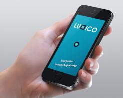
On iPhone.
i really like the logo design and the way you introduce the m into the logo is very neat. the solid square is a bit heavy and does not integrate well with the overall look. please try to soften the design a bit and make it more IOS7
Thanks, all right.
Hello Willem Breytenbach,
This logo is a bit of an adventure because, as you can see, I replaced the M with a (rotated) mobile phone menu icon. I think people will still read the M, automatically. If this idea pleases you, I will be waiting on your feedback!
Best,
Anneke Auer
Rotterdam, the Netherlands
i really like the logo design and the way you introduce the m into the logo is very neat. the solid square is a bit heavy and does not integrate well with the overall look. please try to soften the design a bit and make it more IOS7
 Nederland
 België
 France
 Deutschland
 Österreich
 International
