No comments
Logo for a new trendy restaurant called cachondeo.
- Contest holder: 77z
- Category: Logo design
- Status: Ended
Start date: 08-11-2016
Ending date: 22-11-2016
It all started with an idea...
A short, interactive guide helped them discover their design style and clearly captured what they needed.
Brandsupply is a platform where creative professionals and businesses collaborate on unique projects and designs.
Clients looking for a new logo or brand identity describe what they need. Designers can then participate in the project via Brandsupply by submitting one or more designs. In the end, the client chooses the design they like best.
Costs vary depending on the type of project — from €169 for a business or project name to €539 for a complete website. The client decides how much they want to pay for the entire project.
No comments
Thanks for the different proposals. I do like the bolder types.
No comments
can you do the middle also in white?
No comments
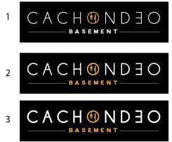
or the basement and the logo in white?
or the basement and the logo in white?
No comments
Hi, we have meant the C to be more bold. A bit like you had it in the beginning. Maybe half as bold as the first try.
Thanks,
First as precedent... after two proposition with bold
the third one!
No comments
the C a bit more bold or will it loose the plate character?
You want the C exactly bold than o ? is it ?
thanks
Thanks for your feedback,
her a new proposition.
we really like that! the title a bit more bold?
No comments
We do like the idea to have a separate capitol letter for our sign outside the restaurant. we are not sure about the filling. you may have some proposals for the inside of the letter. fork and knife in your first design could be a try.
Here, a new proposition
bold looks good! sign a the middle like above mentioned changed.since we are located in the basement lets have a look how it looks with the word basement instead of restaurant.
Hi,
her my proposition, don't hesitate to give me your feeling to evolve your logo. Can you explain me more your project please ?
thanks, best regards
Could you please give me your feeling to evolve this logo ?
thanks
We like that one. especially the e in opposite direction is nice. maybe we could play a little with the font.
 Nederland
 België
 France
 Deutschland
 Österreich
 International
