No comments
Logo for caterer who deliver good and fresh meals at home
- Contest holder: lekker thuis eten
- Category: Logo design
- Status: Ended
- Files: File 1, File 2
Start date: 12-12-2014
Ending date: 07-01-2015
It all started with an idea...
A short, interactive guide helped them discover their design style and clearly captured what they needed.
Brandsupply is a platform where creative professionals and businesses collaborate on unique projects and designs.
Clients looking for a new logo or brand identity describe what they need. Designers can then participate in the project via Brandsupply by submitting one or more designs. In the end, the client chooses the design they like best.
Costs vary depending on the type of project — from €169 for a business or project name to €539 for a complete website. The client decides how much they want to pay for the entire project.
No comments
hi Lekker thuis eten
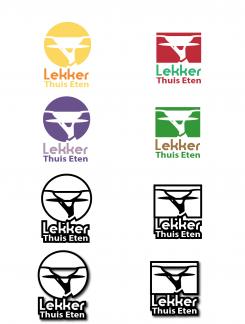
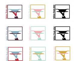
I used now foodcolours and made one black white version
regards Petje
Hi Petje, Tnx for the new options! Four stars for the purple version!
Hi lekker thuis eten
I send it on his own thanks for the compliment on it :)
Regards Petje
No comments
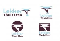
Hi Petje, I like the circle and the square. I'm still not convinced of the colours, (actually; seeing them quite often now, I know it's not the right feeling.) maybe you could give the best colour combination you like.
No comments
Hi Petje,
Thank you for the new option. I think the last feedback I gave you is still applicable. So: like the hand but the letters should be readable. Maybe you could find a combination between stylish and 'clear'?
No comments
Hello lekker thuis eten
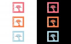
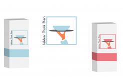
Maybe with the white outline you can place it on all packages thank you for the feedback
With regards petje
The first options you gave were the best options. I mean the one where your comment is ‘I have taking the extra colours of the last pictures’.
We love the hand with the plate. ‘thuis lekker eten’ isn’t very clear. Your colleague Esther gave a very good option (like a mark) but her suggestion is missing something. For example your stylish hand. We know it’s not ethical to ask you to combine those two logo’s (but we should if it was).
- Really good about her logo: steady, good readable, like a mark (font!)
- Really good about your logo: fresh, stylish, different (symbol)
So could you go on with the hand and do ‘something’ with the font?
Something else: you're really doing a great job. It's almost Christmas. No worries when you have something else to do now ;-)
Thank you for the feedback gonna work on it now! :)
And i know its Xmass but i like to work i love it :)
regards Petje
No comments
Hello lekker thuis eten
Did you mean this font and the colors let me know :) and i make the changes !
With nice regards Petje
Yes, I mean this font! I'm still not convinced of the colours. When I see all the colours together, there's some 'wow'-feeling. If I imagine we should use one logo on our packaging or on a business card, then I'm not sure about it.
No comments
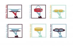
Many creative possibilities! But I actually think the bowl with the 'ears' is the best one.
The option right under had the best readable font. (Of course, the colour is part of it).
Thank You Lekker thuis eten
No comments
Nice options!
- I think the letters should always be legible.
- You Showed us That the logo is ook perfect in black / white, I prefer the first option.
- The ultimate color combination I have not found (I think). Difficult!
Hello Lekker thuis eten
Yes difficult but I think the pantone 530/pantone 5185 itself the most beautiful among those with colors and black/white :)
Regards Petje
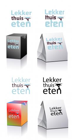
Oké, and now that you know the kind of colours we like, could you perhaps make a suggestion that you like? In the first suggestion you used a box to visualise. That made it very clear. Eventually we're going to use the logo on the packaging of the meals (most important), second website en last but not least on a business card.
No comments
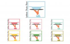
I have taking the extra colours of the last pictures
regards Petje
Great!
Like: the bowl (best)
Like: several colour options. It gives good creative guidelines for different types of meals.
Four more questions:
1. Could you please write lekker thuis eten instead of Lekker Thuis Eten?
2. Could you give some other font options?
3. Could you make an option black/white?
4. I gave your colleague on this platform some suggestions for colours:
- maybe combine pantone 494/pantone 571/white/gold
- maybe combine pantone 550/pantone 5185/pantone 187 and white
- or maybe find here your inspiration: http://www.modernehippies.nl/scholten-baijings/
Maybe you could find some inspiration in it?
Thank you Petje, great job so far!
One more thing: I'm not a designer, so when I suggest four colours and you think that's really stupid, please be cocky/smarty and of course the professional. I'm on my field exactly the same ;-)
Hello lekker thuis eten
i send yust one with the new feedback colors and different fonts and the colors are fine :)
regards petje
No comments
The first option is more stylish and has a very unexpected, fresh, unusual appearance for a caterer. Love it.
Hi
Thank you for the compliment :)and i go furter with the other logodesign
regards Petje
No comments
Oops! I was not expecting that someone would copy exactly this example. Is that possible? Is that legal? But to be honest, I think it's really beautiful! Pls give me some incubation time before I give some more feedback. Tnx!
Hallo lekker thuis eten
Dankje wel en het is geen kopie ik heb de vector zelf getekekent die van het bestand is een echte hand met kopje deze is een vector die ik gemaakt met meer een wok heb dus gewoon legaal en te gebruiken zal nog meer een wok van maken maar dank u wel voor de complimenten
met creatieve groeten petje
Sorrie voor de spelfout getekend :)
No comments
Hi Petje,
Heb je de aanvullende briefing gezien? Het staat inmiddels online en geeft denk ik veel meer sturing op het gebied van kleurgebruik en vibe.
Feedback design:
Colours: *
Symbol: *
Balance: **
Font: ****
Fresh: *
Chic: *
Tasty: *
About the font: it's modern and we would like to have a modern font. The problem with this one is that it's not easy reading.
I hope this feedback is helpful for you. Of course you could always ask me questions when I'm not clear enough ;-)
Hoi Lekker thuis eten
Dankje voor uw extra feedback
Met creatieve groeten Petje
No comments
Beste Petje,
Het is lastig te verwoorden, maar het is 'het' nog niet. Zojuist heb ik twee extra briefings proberen te uploaden, zodra deze online staan (wacht op akkoord van brandsupply) dan zie je precies welke vibe het design zou moeten hebben. Er zijn best wat aanbieders in de markt met veel hetzelfde oubollige design. We willen er uitspringen!
No comments
Dear petje, if you can't read Dutch the first association will be a house broker. I'm sorry, but this is not what we're looking for. Maybe a next try?
Hallo lekker thuis eten
Ik zal een nieuwe inzenden dankje voor uw feedback
met creatieve groeten Petje
 Nederland
 België
 France
 Deutschland
 Österreich
 International
