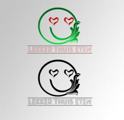
Logo for caterer who deliver good and fresh meals at home

Start date: 12-12-2014

Ending date: 07-01-2015

Total budget: € 199.00
Latest design
Book cover
MiliG

It all started with an idea...

A short, interactive guide helped them discover their design style and clearly captured what they needed.

Needs


For now we need a logo, eventually we also need business cards and packaging design.

Google ‘ready-to-eat meals packaging’ ALL you see is NOT what we would like to be.
Google ‘best design packaging’ and you see a lot of great innovative designs.

NEW! Pls notice I uploaded two new 'inspiration' briefings.

Company description


Name of the company:
lekker thuis eten (translation: nice/good food at home)

Sector:
caterer who deliver at home

USP:
- very good price/quality
- a fresh meal for every day
- for everyone, even with dietary

Target group


Target group:
- Everybody who wants a good, fresh dinner but isn’t able (or don’t want) to prepare the meal himself.

Colors, favourites and other requirements


Wishes for the logo design (principles of logo design):

1. Simple
2. Memorable (time will tell ;-))
3. Timeless
If the logo is used in black/white, it must be timeless. If we use the colours you suggest, it could be more fashionable. By the way: we love distinctive colours!
4. Versatile
We would like to receive it as a vector. The logo will at least be used for business cards, on packaging and website.
5. Appropriate
There’s no better way to explain then to quote David Airy:

‘A logo doesn’t need to say what a company does. Restaurant logos don’t need to show food, dentist logos don’t need to show teeth, furniture store logos don’t need to show furniture. Just because it’s relevant, doesn’t mean you can’t do better. The Mercedes logo isn’t a car. The Virgin Atlantic logo isn’t an airplane. The Apple logo isn’t a computer. Etc..’

Creativity of the logo:
Most important: remain the above principles! The creative part should be particularly shown up in the use of the logo.

Keywords:
No fork & knife!
No script letter!
Fresh
Chic
Tasty


Suggestions for colours:
- maybe combine pantone 494/pantone 571/white/gold
- maybe combine pantone 550/pantone 5185/pantone 187 and white
- or maybe find here your inspiration: http://www.modernehippies.nl/scholten-baijings/

Designer: therawee therawee
logo-therawee-GNCqdq5o

theraweetherawee

pure black and white design logo

This contest is finished. Its not possible to reply anymore.
logo-therawee-F8ZP25Hk

No comments

This contest is finished. Its not possible to reply anymore.
logo-therawee-EWFgECtk

theraweetherawee

black and white logo

This contest is finished. Its not possible to reply anymore.
logo-therawee-C2yn0hLk

No comments

This contest is finished. Its not possible to reply anymore.
logo-therawee-BQf4Coxk

No comments

This contest is finished. Its not possible to reply anymore.
logo-therawee-AC1cb4Bk

No comments

This contest is finished. Its not possible to reply anymore.
logo-therawee-MwlXnA4u

theraweetherawee

hai!! this is raweeteja from india. i designed a new logo that represents a love eyes and fresh smile,overall represents fresh and tasty of food on persons smile face. plz concentrate on logo design first ,then concentrate on font type and colors if needed. and i submitting a logo in black and white .plz comment here for my work.i wil submit it with ur requirements and changes.thanku

lekker thuis etenlekker thuis eten

Wauw! That's pretty fast! Great you really read the briefing well. The logo isn't exactly what we're looking for. It's a bit hard to tell you exactly what the missing link is, but I give it a try:
- the typography: we don't like the lines above or beneath
- the smiley is a bit ehm... too childish. It feels a bit retro.
- the combination of a very modern typography and a retro 'eighties' symbol with some Jugendstill elements isn't in balance.

I hope this comment will be helpfull!

This contest is finished. Its not possible to reply anymore.