No comments
Logo for my new company Nibble which is a delicious healthy snack delivery service for companies
- Contest holder: johnderks
- Category: Logo design
- Status: Ended
Start date: 19-06-2015
Ending date: 26-06-2015
It all started with an idea...
A short, interactive guide helped them discover their design style and clearly captured what they needed.
Brandsupply is a platform where creative professionals and businesses collaborate on unique projects and designs.
Clients looking for a new logo or brand identity describe what they need. Designers can then participate in the project via Brandsupply by submitting one or more designs. In the end, the client chooses the design they like best.
Costs vary depending on the type of project — from €169 for a business or project name to €539 for a complete website. The client decides how much they want to pay for the entire project.
No comments
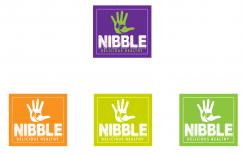
Do you like some of these green? Greeting Sasa
No comments
Hi Sasa, thanks for making these new designs! I like the one on the right a lot. I'll put it on my shortlist.
Maybe just make the green for everything a bit darker.
Then this logo will probably be the winner..
Please use the dark green as used within this logo: http://www.google.nl/imgres?imgurl=http://logopond.com/logos/e5b927bb38990c7fa7a773e9ba9848a1.png&imgrefurl=http://logopond.com/gallery/detail/138013&h=260&w=325&tbnid=N5rs9ZQpoZfv0M:&zoom=1&docid=4pYCX2WVu2k_NM&ei=yrCLVdOuF8uAU_-Bp7gK&tbm=isch&ved=0CFUQMyhRMFE4yAE
I don't mean the very dark green a the bottom of the letters of the example logo but just the general dark green within it.
thank you very much I will change color and I'll do it soon and set. Greeting Sasa
No comments
I did changes I hope that you like. If you have any other suggestions please tell. Greeting Sasa
Hi Sasa, excuse me, I've changed my mind about the businessmodel of my company over the last week as well as my thoughts on what kind of logo I need. The description above is no longer accurate. Instead of a healthy snack delivery service I've decided to go for a healthy vending machine business with the same target group as described above and the same snacks.
Now, what I need is a logo with the name "Nibble" and the slogan "Delicious Healthy Snacks" around the name or under the name and some natural figure like (a) leaf(s). Please make the name and the slogan green. Please use the color combination white and green. Please make the logo simple. I like the Leaf Star logo for example: http://graphicriver.net/item/leaf-star-natural-logo/2374448 (the upper one)
or this one: http://www.google.nl/imgres?imgurl=http://logopond.com/logos/e5b927bb38990c7fa7a773e9ba9848a1.png&imgrefurl=http://logopond.com/gallery/detail/138013&h=260&w=325&tbnid=N5rs9ZQpoZfv0M:&zoom=1&docid=4pYCX2WVu2k_NM&ei=QgKLVZitB8vX7QbE7LxQ&tbm=isch&ved=0CE8QMyhLMEs4yAE
Thanks a lot in advance!
thanks a lot for your suggestions, I did something with leaf I hope you will like it. Greeting Sasa
No comments
The darker shade purple wasn't a good idea.
No comments
The darker shade purple wasn't a good idea.
No comments
The darker shade purple wasn't a good idea.
No comments
I like the logo on the left!
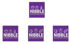
However, please put the hazelnut up, the other way around and on the left of the row, where it is now. For the walnut, please put it left of the middle remove the shell and make it look like just the nut: https://www.google.nl/search?q=walnut&es_sm=91&tbm=isch&tbo=u&source=univ&sa=X&ei=SX2JVYGKFcG2UJqLgegP&ved=0CJ0BEIke&biw=1677&bih=860#imgrc=uSmoj6hqw8B7DM%3A;So1Q3tGTIaPrYM;http%3A%2F%2Fthumbs.dreamstime.com%2Fx%2Fsingle-walnut-16508240.jpg;http%3A%2F%2Fwww.dreamstime.com%2Fstock-photography-single-walnut-white-background-image36170192;400;387.
The almond is fine, please put it on the right of the row.
Please add a vertical brazil nut in the middle, which is naturally somewhat bigger: https://www.google.nl/search?q=brazil+nut&espv=2&biw=1677&bih=860&site=webhp&source=lnms&tbm=isch&sa=X&ei=g4yJVbSFKMWp7AbI-YP4Ag&ved=0CAYQ_AUoAQ#imgrc=nybKLRebvhT9hM%3A;ZRQSS_2TqaIibM;http%3A%2F%2Fthumbs.dreamstime.com%2Fz%2Fbrazil-nut-19097156.jpg;http%3A%2F%2Fwww.dreamstime.com%2Froyalty-free-stock-image-brazil-nut-image19097156;1300;991
Please add a pecan nut like this right of the middle: https://www.google.nl/search?q=pecan+nut&espv=2&biw=1677&bih=860&tbm=isch&tbo=u&source=univ&sa=X&ei=qoSJVdKTMsG-UvL3gZAN&ved=0CJMBEIke#imgrc=q5KRRH26acsvpM%3A;meV3O_JnDE4R9M;http%3A%2F%2Fthumbs.dreamstime.com%2Fz%2Fpecan-nut-isolated-9984542.jpg;http%3A%2F%2Fwww.dreamstime.com%2Fstock-photography-pecan-nut-isolated-image9984542;981;1300
Also, please replace the "delicious healthy snacks" with "awesome healthy snacks"
thanks for your suggestions , I'll do it soon and set. Greeting Sasa
No comments
I really like the one on top! This one is going on my shortlist.
thanks a lot, I will put only the one on the top and replace with "awesome healthy snacks" .
No comments
Hi there! Thanks for your logo design. I really like the purple one.
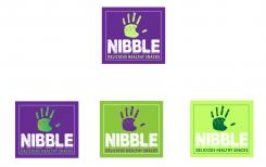
Could you please remove the flower within the hand figure, and make the hand look more like this: https://www.google.nl/search?q=human+healthy+vending&espv=2&biw=1677&bih=860&site=webhp&source=lnms&tbm=isch&sa=X&ei=PkKJVdzZLcj7UuWmgNgE&ved=0CAYQ_AUoAQ#imgrc=9c-K1s49nnsuXM%3A;OPpGcbIdvaVwMM;http%3A%2F%2Fwww.unhappyfranchisee.com%2Fwp-content%2Fuploads%2F2012%2F09%2Fhuman-healthy-vending-logo.jpg;http%3A%2F%2Fwww.unhappyfranchisee.com%2Fcategory%2Ffranchisor%2Fhuman-healthy-vending%2F;298;252
With a more brighter shade of green and the same 'erosion' that you've used for the name?
Please use this same brighter green for the slogan and change the slogan to 'delicious healthy snacks'.
Cheers from a cloudy Amsterdam!
John
thank you very much,I will be made the changes and set up here. Greeting Sasa
No comments
I can see that you like to work from an example.. In this case the logo's of Human Healthy Vending and Bitebox that I said I liked.
Otherwise please try to create a logo that looks exactly like:https://angel.co/farm-hill
but then the figures should be a simple hazelnut, almond and walnut. Please use the same shade of purple that is within the logo of bitebox.com and use some bright apple green somewhere within the logo.
Thank you for your suggestions, I did some changes I hope that you will like. If you have any other suggestions please tell. Greeting Sasa
 Nederland
 België
 France
 Deutschland
 Österreich
 International
