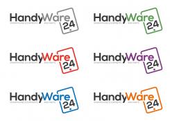
A few color changes :)
logo for my onlineshop for smartphone equipments and parts - handyware24
- Contest holder: handyware24
- Category: Logo design
- Status: Ended
Start date: 31-05-2015
Ending date: 05-07-2015
It all started with an idea...
A short, interactive guide helped them discover their design style and clearly captured what they needed.
Brandsupply is a platform where creative professionals and businesses collaborate on unique projects and designs.
Clients looking for a new logo or brand identity describe what they need. Designers can then participate in the project via Brandsupply by submitting one or more designs. In the end, the client chooses the design they like best.
Costs vary depending on the type of project — from €169 for a business or project name to €539 for a complete website. The client decides how much they want to pay for the entire project.
Here's my design of the logo
thank you a lot for your offer
You're welcome. Thanks for the rating
why did you choose the color orange and grey?
thanks for answer
I chose the dark grey color (which is 80% black) because I think black is a little too dark. I like it a little more soft and smooth but still be black. And I chose orange because it's a happy color. And it makes people enthusiastic to take action, to buy something, which is what you want. Black and orange are both known to be powerful colors.
I can change the colors any way you want, if you like?
could you give me some combinations of other colors which harmonize with each other?
best regards
thank you a lot for your motivation
 Nederland
 België
 France
 Deutschland
 Österreich
 International


