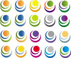
OK, here are the combinations you have asked for. Because of limited number of suggestions we are allowed to give per concurs, I had to put all in one picture. I suggest that you try to look everyone individually, because, maybe, it will look better. For example, my favorites are 3rd logos in 1st and 2nd line. On first looking with all suggestioned logos they may not look as good, but if you watch them separately it's much better. Anyway, I hope you like it. Greetings!
Logo for small strategy consulting firm
- Contest holder: Adri.Kraa@gmail.com
- Category: Logo design
- Status: Ended
Start date: 23-08-2012
Ending date: 06-09-2012
It all started with an idea...
A short, interactive guide helped them discover their design style and clearly captured what they needed.
Brandsupply is a platform where creative professionals and businesses collaborate on unique projects and designs.
Clients looking for a new logo or brand identity describe what they need. Designers can then participate in the project via Brandsupply by submitting one or more designs. In the end, the client chooses the design they like best.
Costs vary depending on the type of project — from €169 for a business or project name to €539 for a complete website. The client decides how much they want to pay for the entire project.
Here are my suggestions for colors. If you like any tell me, or if you want combinations of some of offered colors, I'll add it. Hope you'll like some of these. Greetings!
yes, thanks. lets stick to this figure as the candidate. then can you try one with orange dot, blue and black (or grey ) circle - and then with the full name and suBText baxk again. "strategies" in black or blue and "inc" in orange. subtext in black or grey with full stops (dots) afte each word. then we will choose from those
No comments
Here shapes represent: Analyse, Strategize, Realise
this is a very strong and warm logo. Could you play with the colours and use the blue and orange of the others. thank you and have a nice evening
No comments
thanks. I like it more than the other design. But it does not directly hit a nerve with me. I miss how it represent our specific vision and approach...
Thanks for replays. It is good when people that asks for an logo answer and comment all logos. I very appreciate this, and the other designers too. I will try to make some other logos, and I hope it will be better. Greetings!
Greetings. This is my suggestion.
Any yours suggestion are welcome.
Hi thanks!
I think the design is a bit too busy and not really a simple business like logo. The font of the letters on top are not 'tight' enough for my taste. I also don't directly understand the message this should give....
 Nederland
 België
 France
 Deutschland
 Österreich
 International


