No comments
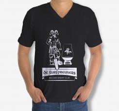
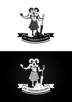
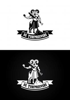
Logo Illustration for t shirts of Belgian whiskyclub De Turfpreuvers’
- Contest holder: Turfpreuvers
- Category: Logo design
- Status: Ended
- Files: File 1, File 2
Start date: 03-10-2019
Ending date: 17-10-2019
It all started with an idea...
A short, interactive guide helped them discover their design style and clearly captured what they needed.
Brandsupply is a platform where creative professionals and businesses collaborate on unique projects and designs.
Clients looking for a new logo or brand identity describe what they need. Designers can then participate in the project via Brandsupply by submitting one or more designs. In the end, the client chooses the design they like best.
Costs vary depending on the type of project — from €169 for a business or project name to €539 for a complete website. The client decides how much they want to pay for the entire project.
Very cool!
Thanks! Let me know if I can be more helpful.
Regards,
Krisi
No comments
Hello,
I change font-with Celtic and I make whole kilt in squares.
Let me know what do you think.
Regards,
Krisi
Super!!! Could you make the squares of the kilt go untill the belt?
Super!!! Could you make the squares of the kilt go untill the belt?
No comments
Hi... I make the adjustments..
It have a little bit difference in "belt" between two pictures but this is because of the different backgrounds.
Let me know what do you think.
Regards,
Krisi
Hi Krisi, the adjustement with the belt is great. This looks fantastic. We have one small request. I have added a third attachment to the competitie info. This is a picture of scottisch Celtic font.. could you try that font instead of the one you have now? To see if this fits or not? Thx, for the rest all the adjustements are great!
Hi... Sorry but I can't see the third attachment.
If you want you can give a link here..
http://www.designtos.com/post_scottish-celtic-fonts_602710/
To give you an idea
An i got another piece of feedback.. could you make a version with the kilt totally in squares?
No comments
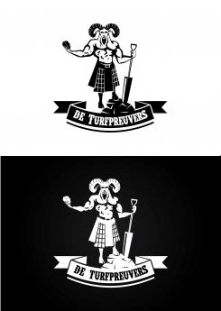
Super interpretation of our feedback! Thx! We now stil feel that there is something a bit strange in the transition of the belly to the kilt. Could you maybe try to give belly a more six-pack feeling and maybe incorporate belly-button? Now it has a strange shape in the black and white contrast... but this already looks really great! Curious if anybody can top this! Finally also, the ‘T’ in the club name does not have to be bigger or a capital T to our feel.. just the same font size as the rest! Thx!
No comments
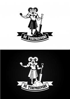
Very nice concept! Can you change two things? Can you make it so that he puts the shovel downwards on the little pile of peat like he is ‘leaning’ on it? And can you remove the two back legs and back part of the goat? The two front goat legs are enough and makes it a bit more ‘human’. We like the black background - white picture best. It gives the incest contrast.. very nice and thx!
 Nederland
 België
 France
 Deutschland
 Österreich
 International
