No comments
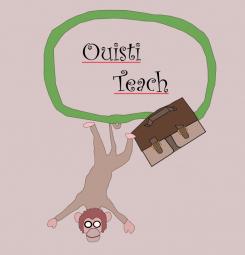
LOGO of a MONKEY who proudly holds a BANANA
- Contest holder: Big Ben Junior
- Category: Logo design
- Status: Ended
Start date: 10-08-2015
Ending date: 31-08-2015
It all started with an idea...
A short, interactive guide helped them discover their design style and clearly captured what they needed.
Brandsupply is a platform where creative professionals and businesses collaborate on unique projects and designs.
Clients looking for a new logo or brand identity describe what they need. Designers can then participate in the project via Brandsupply by submitting one or more designs. In the end, the client chooses the design they like best.
Costs vary depending on the type of project — from €169 for a business or project name to €539 for a complete website. The client decides how much they want to pay for the entire project.
Unfortunately I prefere the previous monkey. This one is not common but he is quiet ugly :X and look quiet stupid too. Moreover his arm is very strange... You can do better :)
Yeah I know I can and I agree with you that this was a worse try .. I will give it another try later. :-)
No comments
Great, it is not a thug monkey anymore :) Unfortunately I have a new problem now. I find your monkey very cute, simple and happy but he lacks of charisma... he is too common. I would like a monkey for this brand which could be recognized between 100 others monkeys. Moreover, we have the feeling that your monkey is using the banana as a cellphone, I dont like this because it can create confusion. I invite you to work on these two remarks in order to raise your monkey to the next level, good luck !
No comments
Ok, I like it because your monkey is cute, simple and funny. However I have a problem because in small size, the monkey looks like a thief. Do you see what I mean ? It seems that your monkey wears a balaclava !! What a shame for a studious monkey. Can you fix that please ? Maybe only by removing the glasses... Thank you :)
Thanks for your comments again! I see what you mean and will work on that!
No comments
Thanks for these new versions ! I am gonna make comments on the last one as it is the one I prefere (he looks more simple and more funny !)
No comments
Ok, I really prefere this skin color, forget about the white please ;) It is a good work, your logo is original but I have a problem... it is too big and sophisticated. I need something smaller and more simple. Also, I am afraid that your logo could be seen as too childlike by 16-18 years old teenagers. Please keep in mind these recommendations for your futur proposals.
No comments
Hello, thank you for your work ! I like the simplicity of your logo but I am not really satisfied with your monkey. He seems very friendly but I dont find him cute enough and he lacks of charisma, he is too common. Also, I dont like the color layout. Blue and yellow are great but I dont like this color scheme combined with a brown-white monkey. I invite you to keep the idea of a monkey inside a blue cercle with the toga hat while drawing a totaly new monkey. Good luck !
Hi, thanks for the feedback and ratings! I will work on it and will show more as soon as possible.
 Nederland
 België
 France
 Deutschland
 Österreich
 International


