No comments
Logo update for web agency
- Contest holder: stendal
- Category: Logo design
- Status: Ended
- Files: File 1, File 2
Start date: 09-03-2015
Ending date: 25-03-2015
It all started with an idea...
A short, interactive guide helped them discover their design style and clearly captured what they needed.
Brandsupply is a platform where creative professionals and businesses collaborate on unique projects and designs.
Clients looking for a new logo or brand identity describe what they need. Designers can then participate in the project via Brandsupply by submitting one or more designs. In the end, the client chooses the design they like best.
Costs vary depending on the type of project — from €169 for a business or project name to €539 for a complete website. The client decides how much they want to pay for the entire project.
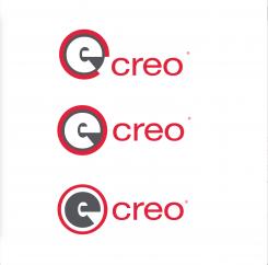
3 others variations of my concept...
Best regards
Arago24
Hi Stendal!
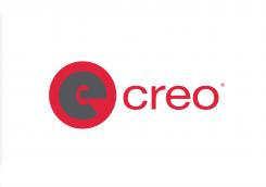
My proposal for your logo optmisation.
I kept the creo part unchanged, as it's not concerned by the confusion problem with e-boks logo. I choosed to break the red/white association in the e part, which is very distinctive and identifying in both e creo and e Boks logo. To keep the red, I changed the e colour for a dark grey. Also I changed the e background shape for a circular one matching with the new e typo.
Please let me know how you feel with this vision.
Best regards,
Arago24
 Nederland
 België
 France
 Deutschland
 Österreich
 International
