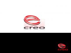
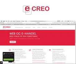
Hello, I have thought about your logo redisign project and this is the change that separate your logo from e-Boks. The letters are all uppercase and I upgraded the square in two modern ones. Colors are like ones in the web page and it is like in old logo. Must have connection to the old logo (color, square) but is very recognizable and different from e-boks. Hope to like it too. Response is more than welcome, sinceraly, Sanja
Logo update for web agency
- Contest holder: stendal
- Category: Logo design
- Status: Ended
- Files: File 1, File 2
Start date: 09-03-2015
Ending date: 25-03-2015
It all started with an idea...
A short, interactive guide helped them discover their design style and clearly captured what they needed.
Brandsupply is a platform where creative professionals and businesses collaborate on unique projects and designs.
Clients looking for a new logo or brand identity describe what they need. Designers can then participate in the project via Brandsupply by submitting one or more designs. In the end, the client chooses the design they like best.
Costs vary depending on the type of project — from €169 for a business or project name to €539 for a complete website. The client decides how much they want to pay for the entire project.
 Nederland
 België
 France
 Deutschland
 Österreich
 International

