Hello,
I remain at your entire disposal.
Have a good day!
Logo wanted for writingcompany
- Contest holder: dekraan
- Category: Logo design
- Status: Ended
Start date: 27-10-2012
Ending date: 10-11-2012
It all started with an idea...
A short, interactive guide helped them discover their design style and clearly captured what they needed.
Brandsupply is a platform where creative professionals and businesses collaborate on unique projects and designs.
Clients looking for a new logo or brand identity describe what they need. Designers can then participate in the project via Brandsupply by submitting one or more designs. In the end, the client chooses the design they like best.
Costs vary depending on the type of project — from €169 for a business or project name to €539 for a complete website. The client decides how much they want to pay for the entire project.
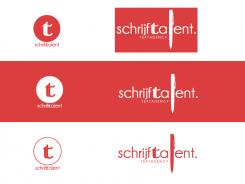
The idea to combine the S and T is good, but here, I do not really understand what you did with the T, while the pen as an L is way too big for my taste. I would prefer a symbol with a loose companyname (so the circle), but something else..
Hello,
Thanks for your comment, i don't understand very well that you want exactly. I wll reduce the pen. The "T" looks like a font calligraphy, and it's the letter at the center of the word (where the eye lands first).
For the logo (on the left), what don't you like? The circle? What do you prefer?
Thank you for your answer.
Have a good day
PS: Sorry for my bad english.
Hi there, well... my English is as bad as yours, maybe even worse :) what I mean is: I prefer a logo such as the bartodell one from my examplelist: a companyname below, and then above a symbol. Just like your examples on the left :)
What I don't understand, is what you did with the T inside that circle. It has a double line, it seems? What does that represent?
Greets!
 Nederland
 België
 France
 Deutschland
 Österreich
 International

