* another adjustments
Zane
Modern logo for a new web app
- Contest holder: Marc Crouch
- Category: Logo design
- Status: Ended
- Files: File 1
Start date: 05-02-2016
Ending date: 12-02-2016
It all started with an idea...
A short, interactive guide helped them discover their design style and clearly captured what they needed.
Brandsupply is a platform where creative professionals and businesses collaborate on unique projects and designs.
Clients looking for a new logo or brand identity describe what they need. Designers can then participate in the project via Brandsupply by submitting one or more designs. In the end, the client chooses the design they like best.
Costs vary depending on the type of project — from €169 for a business or project name to €539 for a complete website. The client decides how much they want to pay for the entire project.
Hello,
Little bit changed the version of my previous design.
Regards,
Zane
Hello,
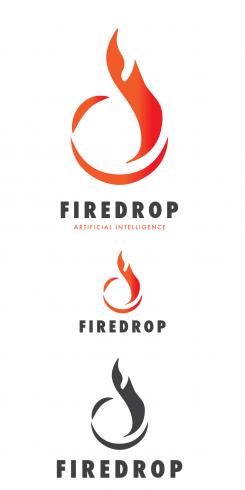
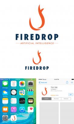
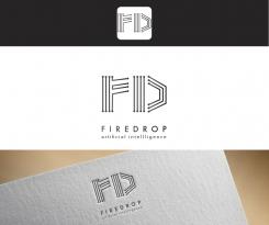
I made the design using negative space and creating fire flame. Although you said that you would not like to see the usage of F and D, I incorporated them in this design in that way creating flame.
I made the preview of how it would look like as an app. I think that its good to have an icon that is simple and clean, so it can be easily recognisable also resized.
Regards,
Zane
And here are the black and white versions.
Looking forward to hearing from you,
Best Regards,
Zane
Hello,
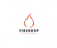
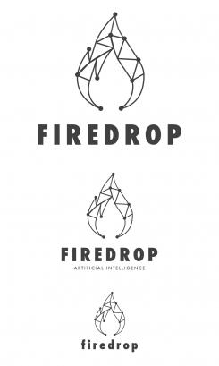
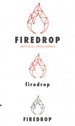
I made the version with fore drop and including the artificial intelligence elements such as nodes and lines.
I made it in red colour scheme, as well in black and orange and also provide you with black and white colour scheme so you can see how it would work.
I made it simple, not adding too much details to create it unique but still easily usable.
Looking forward to hearing from you,
Regards,
Zane
Here are some previews of black and white versions.
Regards,
Zane
I would prefer if you didn't focus on trying to work the "F" and "D" into the symbol.
Some ideas to help you:
- A "firedrop" made up of digital-looking squares.
- A "firedrop" made up of lines like a labyrinth.
- A "firedrop" cutout over a background of sprayed paint or something (like the aol logo).
- A "firedrop" made of small circles or something similar (like the Uniliver logo).
- A design that incorporates nodes (circles at the end of a line that connect, like a circuit board or brain).
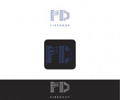
And here are :
The first version - in blue;
The option of how the icon would look like when used as an app symbol;
The white version of logo on black background.
Regards,
Zane
I would prefer if you didn't focus on trying to work the "F" and "D" into the symbol.
Some ideas to help you:
- A "firedrop" made up of digital-looking squares.
- A "firedrop" made up of lines like a labyrinth.
- A "firedrop" cutout over a background of sprayed paint or something (like the aol logo).
- A "firedrop" made of small circles or something similar (like the Uniliver logo).
- A design that incorporates nodes (circles at the end of a line that connect, like a circuit board or brain).
Hello,
Thank you for your feedback!
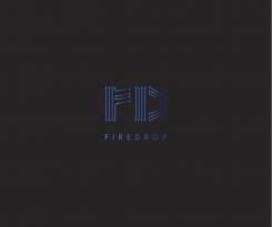
I went in the more "artificial intelligence" direction making the letters F and D more technical looking. Also to achieve the right effect I used the blue colour scheme with gradients.
I will provide you also with black and white options, but let me know if this is something you had imagined or if this could work?
Looking forward to hearing from you,
Best Regards,
Zane
I would prefer if you didn't focus on trying to work the "F" and "D" into the symbol.
Some ideas to help you:
- A "firedrop" made up of digital-looking squares.
- A "firedrop" made up of lines like a labyrinth.
- A "firedrop" cutout over a background of sprayed paint or something (like the aol logo).
- A "firedrop" made of small circles or something similar (like the Uniliver logo).
- A design that incorporates nodes (circles at the end of a line that connect, like a circuit board or brain).
Hello,
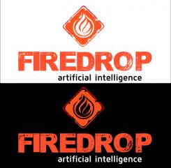
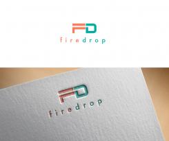
Making this logo I kept in mind that this is for technologies and modern environment so I kept it clean and simple. Creating figures I made the icon from F and D and did that in your provided colour scheme.
Looking forward hearing from you,
Regards,
Zane
This is not what we are looking for. But I like your style. Any other ideas? You need to somehow convey the concept of artificial intellligence.
I would prefer if you didn't focus on trying to work the "F" and "D" into the symbol.
Some ideas to help you:
- A "firedrop" made up of digital-looking squares.
- A "firedrop" made up of lines like a labyrinth.
- A "firedrop" cutout over a background of sprayed paint or something (like the aol logo).
- A "firedrop" made of small circles or something similar (like the Uniliver logo).
- A design that incorporates nodes (circles at the end of a line that connect, like a circuit board or brain).
 Nederland
 België
 France
 Deutschland
 Österreich
 International
