No comments
Motorcycle fan club is looking for an awesome logo
- Contest holder: Menni
- Category: Logo design
- Status: Ended
- Files: File 1, File 2
Start date: 19-02-2020
Ending date: 04-03-2020
It all started with an idea...
A short, interactive guide helped them discover their design style and clearly captured what they needed.
Brandsupply is a platform where creative professionals and businesses collaborate on unique projects and designs.
Clients looking for a new logo or brand identity describe what they need. Designers can then participate in the project via Brandsupply by submitting one or more designs. In the end, the client chooses the design they like best.
Costs vary depending on the type of project — from €169 for a business or project name to €539 for a complete website. The client decides how much they want to pay for the entire project.
No comments
Good morning Manni, as you can see i have been busy. That's because i just love bikes. Hope you like one or all of my concepts. Hope to hear from you. mvg WSS
Your concepts get better every time :) That doesn't make it easier for me to make a decision :) Independently of that, I will collect all the designs, and then discuss them in our group at the end of the competition. Thanks for your efforts! Everything really looks great!
Thanx Menni for your kind words. mvg WSS
Just want to say this. You may not realise how much infomation you gave me. And its because of your feedback that the concepts get better. mvg WSS
No comments
Hi Menni, the main problem is if i take too much detail out of the illustration, it becomes unrecognizable, If you don't know motorcycles you could think it was Honda Afria Twin or a Yamaha Tennere, or a Moto Guzzi Stelvio. So i tried useing a front shot illustration so that the opposed twin engine, the "worlds" most recognizable engine, can be seen. then other details become less important. What do you think ? WSS
It's still concept so you can see guide-line and other stuff which won't be in finished job. It would seem i am the only designer who knows what a Beemer GS is. I rode bikes for 35 years. WSS
By the way Menni, you can never say to much the more information i have, the more YOU think out loud the better the result. So.
1. Side view or front view.
2. Font black or colours.
3. Slogan ? What about......."GS, it's a way of life". I am english. And ivé read strange japanese slogans all my life. Suzuki "Ride the winds of change"??????? WTF does that mean.
Glad to hear you're a biker too!
I like that, too. However, it is true that we do not only drive the thick 1200/1250 GSes Boxer, but also the small F700/750 F800/850's. And they don't have a Boxer engine :)
I don't know if I can attach links here. But I try: https://www.tourenfahrer.de/fileadmin/_processed_/8/5/csm_bmw-motorrad-days_2018_preview_1140_722242e1df.jpg
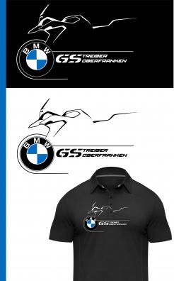
Take a look at this drawing. Clear shape, all said and done. We can't use it like this, with copyright and all. But something like that would be nice. We have to make sure that we can somehow put design on t-shirts in a proper way.
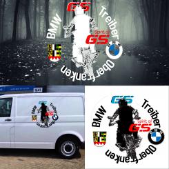
I think the text "Oberfranken" should be read from left to right and not upside down. And that "Spirit of GS" is unfortunately already too much. Since we have quite a lot of text in the circle anyway, we should do without another slogan. Otherwise this will be too much. Font should be black and/or white.
No comments
The "GS" is much better here because it is close to the original. Nice! The BMW emblem as wheel hub is also a nice idea. The font is not so easy to read. Maybe a bit closer to the original. The BMW font is very simple. Maybe have a look at bmw-motorrad.com, then you know what I mean.
The "Spirit Of GS" is generally also very nice, but here now I think too much.
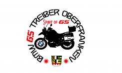
Maybe you can put "BMW GS drivers" in the upper half and Upper Franconia underneath in the semicircle.
The logo of BMW as well as the Upper Franconian coat of arms then left and right of the motorcycle? And if it is possible somehow, the motorcycle not so detailed.
LOL...it has to be called "BMW GS Treiber" und "Oberfranken" of course....
ok
No comments
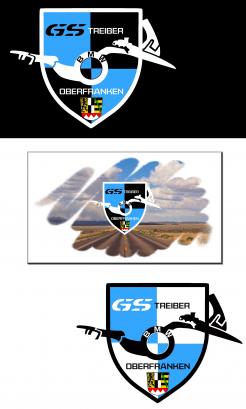
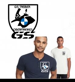
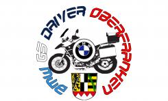
Not so bad! But not "Driver" but "Treiber" - it´s important for us :) However, I am afraid that printing - or flocking - on a T-shirt will be quite difficult because there are too many details. Basically I like the idea with the emblem of Upper Franconia very much.
Not so bad! But not "Driver" but "Treiber" - it´s important for us :) However, I am afraid that printing - or flocking - on a T-shirt will be quite difficult because there are too many details. Basically I like the idea with the emblem of Upper Franconia very much.
So less details in the Bike OK, Do you like the lettertype? WSS
 Nederland
 België
 France
 Deutschland
 Österreich
 International
