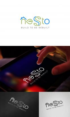
Here is a logo variation with rounded corners and softer/rounded fonts.
New logo for sustainable and dismountable houses : NESTO
- Contest holder: Luxusbierger
- Category: Logo design
- Status: Ended
Start date: 25-06-2016
Ending date: 09-07-2016
It all started with an idea...
A short, interactive guide helped them discover their design style and clearly captured what they needed.
Brandsupply is a platform where creative professionals and businesses collaborate on unique projects and designs.
Clients looking for a new logo or brand identity describe what they need. Designers can then participate in the project via Brandsupply by submitting one or more designs. In the end, the client chooses the design they like best.
Costs vary depending on the type of project — from €169 for a business or project name to €539 for a complete website. The client decides how much they want to pay for the entire project.
Hoi Lyra;
Mijn naam is Maartje, van Huis van Maartje grafisch ontwerp.
Als grafisch ontwerpers is het mooi te zien dat we elkaar kunnen inspireren. Echter moet het me van het hart dat jouw ontwerp voor NESTO me wel heeeel erg bekent voorkomt.
Mijn concept van het 'infinityhuis',
de opbouw van het logo in zn geheel
en zelfs het kleurengebruik en gradienttoepassing in het beeldmerk zijn overgenomen.
Ik vind het als collega ontwerpers dan ook teleurstellend te zien dat een conceptontwerp wordt overgenomen en slechts met een paar kleine aanpassingen in vorm onder een andere naam wordt geplaatst.
Alhoewel ik me gevleid voel dat je door mijn ontwerp geinspireerd bent, vind ik dat we als ontwerpers de lat toch iets hoger mogen leggen dan kopieer en plakwerk. Wel zo eerlijk naar elkaar en vooral naar jezelf.
Vriendelijke groet, Maartje
ow ja, en als vierde ook nog het font.
https://t3.ftcdn.net/jpg/00/92/88/86/160_F_92888652_M4tz0xDyVoadomGe8ayvZgyWwlGls8z4.jpg
Hello Huis van Maartje, can you try to be honest and compete fairly, without attempting to influence the contest holder by misrepresenting and attacking the other [4-star-rated] designers without any argumentation.
1) None of my submitted designs follow the concept of your logo submission, neither were inspired by "your" [or any other] designer's concept. I followed the contest brief and based my logo on the CH wishes, Houses + infinity sign [integrated], which are common elements of graphic design.
However, your logo submission is very similar to these, already existing, logo designs [see the 2 existing logos here >
a) https://t4.ftcdn.net/jpg/00/92/69/07/240_F_92690724_KDJwioOyrS7PlTwmJ8AgMsUWL7nTr701.jpg ],
b) https://dribbble.com/shots/491175-Boligklubben
Why do you say then that you are the originator of that concept?
Applying your criteria, we can say now that you are actually the one who has "stolen" the other designer's concept. Aren't you?
2) If you can stand behind what you wrote at my contest page, why didn't you report my designs to Brandsupply?
3) As a designer, you supposed to be familiar with Concept Originality Policy and be aware of the fact that any concept presented in the brief can be developed by all designers. If the CH stated that he/she wanted the infinity symbol for his housing project [mentioning nature, air and water quality, healthy building...] you should understand that some similarity in shapes and colors are to be expected and that obvious concepts [with houses and infinity symbol] are open to be developed by all designers. And you can not claim any rights neither to the infinity-houses concept, nor the blue-green color-combination, use of gradient, rounded font....
4) On the other hand, offering extra items [business cards & letterhead] that were neither asked by the CH nor belong to the the logo contest category, IS against the code of conduct; and you are the only designer in this contest who offered it; only in that sense your submissions are unique in this contest...
Therefore, once again - just try to compete fairly, please.
Best regards,
Lyra
Thanks! I'm glad you like it. Here is the logo variation [with different colors and fonts]. If you have some color and font preferences, please let me know.
ps please don't forget to enlarge the images to see the details
Here is my new concept for your logo now based on the house icons in the infinity form, reflecting the frame of life- transgenerational values, re-use the resources used for the next building.
The entire images has an upward [arrow] movement that refers to a healthy building and upcycle, giving the logo a positive message.
I look forward to receiving your feedback.
[correction: the entire image has an upward movement]
Like that one much more txs
Here is my concept for your logo featuring
- an image of a house, integrated in the letter "n"
- the letter "e" in the form of a leaf [referring to the "healthy idea" you'd like to see in the logo]
- a symbol for the infinity incorporated in the letter "s"
The logo is clean, simple and suitable for online and offline media, for web and for print. It works great in full color and black & white, at all sizes, on different backgrounds and materials.
Please, don't forget to enlarge/click on the images to see the actual colors and details. [Any color combination available on request.]
Your feedback is welcome.
Kind regards,
Lyra
Hi , Luxusbierger,
One question regarding the slogan you asked for:
shouldn't it be "build to be rebuilt" [or at least arch.form. "build to be rebuilded" instead of "build to be rebuild"?
Hi Lyra,
You are right it should be build to be rebuilt
thanks! a new logo proposal is coming very soon:)
The infinity in the S is really difiicult to see... I personally do not like that too much
I understand, no problem. I've just made a new proposal based on a completely different concept.
 Nederland
 België
 France
 Deutschland
 Österreich
 International
