No comments
New logo for Twinx
- Contest holder: pvdwerf
- Category: Logo design
- Status: Ended
Start date: 06-03-2014
Ending date: 06-04-2014
It all started with an idea...
A short, interactive guide helped them discover their design style and clearly captured what they needed.
Brandsupply is a platform where creative professionals and businesses collaborate on unique projects and designs.
Clients looking for a new logo or brand identity describe what they need. Designers can then participate in the project via Brandsupply by submitting one or more designs. In the end, the client chooses the design they like best.
Costs vary depending on the type of project — from €169 for a business or project name to €539 for a complete website. The client decides how much they want to pay for the entire project.
Hello,
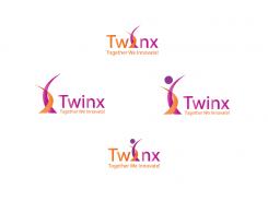
Here is a new combination of colors.
Regards.
Hello,
Thank you for your feedback.
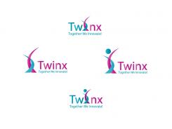
Here is a new proposal of color. I put a corporate blue.
Regards
Here as requested, a new combination of colors.
Regards.
Thanks, still the customer is looking for a striking colours that have a corporate identity. The light blue or green is striking but misses the corporate touch. Twinx must be read as one word so the accent must be at the mark instead of at the letters. Thanks!
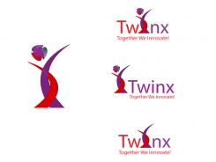
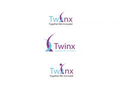
A variant with the dot on the "i" in two color.
I remain at your disposal.
Regards.
flamenco72
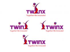
Hi, thanks again for your designs. You have chosen for a new color combination but to me it still looks a little flat. The customer is looking for a more chique appearance (with purple and ......) The 'head' on the i is a nice detail.
Hello,
Here are the requested changes. I put three examples.
I remain at your disposal.
Regards.
flamenco72
Hello,
Here is my proposal.
I am at your disposal to make all the changes you want.
Regards.
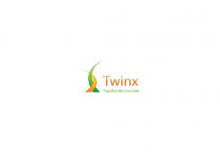
Hi, thanks for your design, we certainly like it and being able to use the symbol as a standalone mark.
Two requests:
-Could you perhaps create a variation where you use the symbol as the "i" in Twinx?
-Could you think about different colors. The green and orange in the symbol are nice as they are complementary, but maybe some variantion towards purple? (like in the old logo).
Regards,
Peter
 Nederland
 België
 France
 Deutschland
 Österreich
 International
