No comments
No waste Drink Cup
- Contest holder: BREGO
- Category: Logo design
- Status: Ended
Start date: 12-01-2021
Ending date: 18-01-2021
It all started with an idea...
A short, interactive guide helped them discover their design style and clearly captured what they needed.
Brandsupply is a platform where creative professionals and businesses collaborate on unique projects and designs.
Clients looking for a new logo or brand identity describe what they need. Designers can then participate in the project via Brandsupply by submitting one or more designs. In the end, the client chooses the design they like best.
Costs vary depending on the type of project — from €169 for a business or project name to €539 for a complete website. The client decides how much they want to pay for the entire project.
No comments
Hello,
Here is the explanation of my logo :
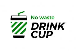
First of all, the shape of the logo represents a stylized glass. I chose the color green in order to evoke the "green" and "no waste" aspect of Drink Cup. Secondly, the font used is a very clean and easily readable font (even if you're a bit drunk...). It has been italicized to make it more dynamic and memorable. Finally, by removing the black parts of the logo, it is possible to see a trash can with "no waste" written on its right to incite people not to throw it away. It could be interesting to put a phosphorescent effect when printing, so that you can see only the green part at night.
(Sorry for my poor English, I'm a French designer.)
Have a nice day,
Yours sincerely,
BasG
 Nederland
 België
 France
 Deutschland
 Österreich
 International


