No comments
Professional, cool logo with energy for a lifestyle coach and business consultant in vitality
- Contest holder: anneke peters
- Category: Logo design
- Status: Ended
Start date: 24-04-2014
Ending date: 08-05-2014
It all started with an idea...
A short, interactive guide helped them discover their design style and clearly captured what they needed.
Brandsupply is a platform where creative professionals and businesses collaborate on unique projects and designs.
Clients looking for a new logo or brand identity describe what they need. Designers can then participate in the project via Brandsupply by submitting one or more designs. In the end, the client chooses the design they like best.
Costs vary depending on the type of project — from €169 for a business or project name to €539 for a complete website. The client decides how much they want to pay for the entire project.
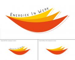
The shape I created is - what you cannot see immediately - one quarter of the infinite symbol (that reversed 8) which means that in the endless space of time You coach people to "manage their energy" (as you said). It's also the energy, the mind, the enthusiasm/motivation which is endless. When managing sports, nutrition and sleep (3 colors) you have that "full power" being as "powerful" as a "flame". The three colors together here create that shape which is a union of that balanced physics, (kind of energetic harmony). The yellow color stays also for the sun, the light, the light orange color for creativity/cheerfulness/mind/frequency/dynamism and the reddish orange for the life energy. Furthermore you can see in the shape a part of a muscle structure/cell tissue or blood circulation (physics).
Thus, the shape symbolizes a balance, a bed (whith a bit of imagination;-) ) (feeling at ease/relaxing/sleeping) and a smile. The things You teach/coach people makes them improve their lifestyle, leading a more balanced and therefore a happier life.
The right side or end of the "flames" form a zig-zag shape or shade which makes appear an "E" and simultaneously a "W". They stay of course for "Energy" or "Energiek" and "Works" or "Werk". Even if using the logo without the Name "Energiek in Werk" the logo still contains the initials of the name.
:-)
 Nederland
 België
 France
 Deutschland
 Österreich
 International

