Hi there,
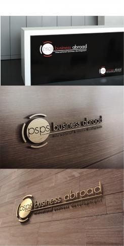
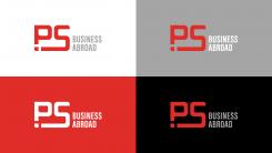
Here is my design, I hope you like it. I will admit, the grey I used is 25& lighter than the one you described. I made this decision because the grey was taking too much attention from the main logo. And because it was unreadable on black.
I also didn't put in your full name 'psps business abroad international business development'. Because you definitely don't want to say business twice. And 'business abroad' and 'international business' is basically the same.
Also, if you make you brand name that long, it takes away the power. Less is more.
For example. Philips, Coca Cola, Apple, etc.
I look forward to seeing who you chose as winner!
Re branding thus adaptation of current logo
- Contest holder: Peter Sanders
- Category: Logo design
- Status: Ended
- Files: File 1
Start date: 07-03-2019
Ending date: 09-04-2019
It all started with an idea...
A short, interactive guide helped them discover their design style and clearly captured what they needed.
Brandsupply is a platform where creative professionals and businesses collaborate on unique projects and designs.
Clients looking for a new logo or brand identity describe what they need. Designers can then participate in the project via Brandsupply by submitting one or more designs. In the end, the client chooses the design they like best.
Costs vary depending on the type of project — from €169 for a business or project name to €539 for a complete website. The client decides how much they want to pay for the entire project.
 Nederland
 België
 France
 Deutschland
 Österreich
 International

