No comments
Sisters (bistro)
- Contest holder: 2Sisters
- Category: Logo design
- Status: Ended
Start date: 20-10-2012
Ending date: 05-11-2012
It all started with an idea...
A short, interactive guide helped them discover their design style and clearly captured what they needed.
Brandsupply is a platform where creative professionals and businesses collaborate on unique projects and designs.
Clients looking for a new logo or brand identity describe what they need. Designers can then participate in the project via Brandsupply by submitting one or more designs. In the end, the client chooses the design they like best.
Costs vary depending on the type of project — from €169 for a business or project name to €539 for a complete website. The client decides how much they want to pay for the entire project.
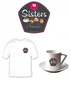
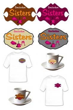
Hello, I realized something more detailed to foods, if the logo in him even you agree for its shape and design I can put more simplified images
No comments
Do Like the shape! You may delete "Bistro". Please add "Since 2013". Please replace the butterfly by the champagne-glasses. Let's see how it looks.
No comments
And you think what for the one above
No comments
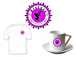
Voor ons iets te ouderwets. Het heeft iets middeleeuws..
Do like the two ladies, alyhough again to gothic, do you have something friendlier?
No comments
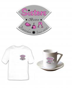
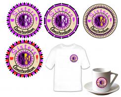
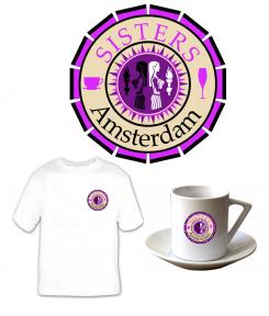
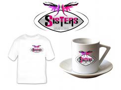
Here is what I propose I have change the fairies by the astrological sign of Gemini, which, to me, symbolizes the two sisters.
Like it much better, thanks. Could you use the lettertype you used before?
No comments
Cool, we like this better... How would it look like without the angels? Or the angels on both sides?
Do you have any idea about other signs? We defintitely like the center. Thanks!
Could you try the above?
yes I am going to work on this one.
Have you a préference on l 'image to be inserted? If the fairies do not admit you.
Maybe try champagne-glasses, cocktail-glasses or something completely different. We liked the way you were thinking, and do like a particular sign... just not sure what it could be. Do you have any "out-of-box"-suggestions?
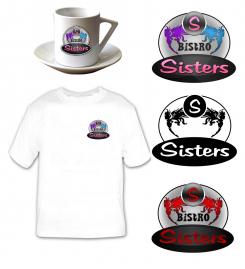
We really like the powerful colors and the clear lettertype. It's clear from a distance.
No comments
Like it better than the previous! Although still think the fairies are a little scary, the may be sweeter. You may delete the word Bistro. We preferred the lettertype of the previous one.
No comments
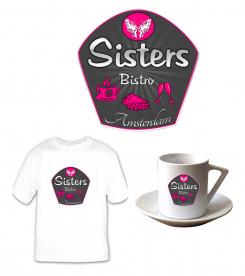
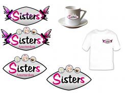
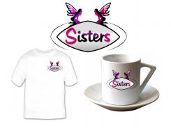
Hello, you wanted something modern, colors can be changed, I have symbolyser the two sisters by two fairies hope this logo surely it.
Hi! We like the fairies, although they may be a little friendlier, the look a little gothic now. We like the colors purple, red, pink, although other colors are welcome. The S seperate is not necessary. "Sisters" should be the bullseye. Like how you shouw it on mug and tshirt. Thanks!
 Nederland
 België
 France
 Deutschland
 Österreich
 International
