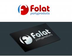
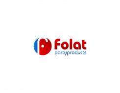
Hello Contest Holder,I made the design with initial "f" more recognizable.Please check it & provide your feedback,,thank you
Rgrds
Slamet77
Restyle logo/corporate identity
- Contest holder: FOLATBV
- Category: Logo & stationery
- Status: Ended
Start date: 21-10-2014
Ending date: 20-11-2014
It all started with an idea...
A short, interactive guide helped them discover their design style and clearly captured what they needed.
Brandsupply is a platform where creative professionals and businesses collaborate on unique projects and designs.
Clients looking for a new logo or brand identity describe what they need. Designers can then participate in the project via Brandsupply by submitting one or more designs. In the end, the client chooses the design they like best.
Costs vary depending on the type of project — from €169 for a business or project name to €539 for a complete website. The client decides how much they want to pay for the entire project.
No comments
Zakelijk, strak en toch herkenbaar. Weet alleen niet precies wat het element voor moet stellen. Maar kan jij waarschijnlijk wel toelichten. Volgende week maken we een selectie van 2 of 3 waar we de laatste ronde mee verder gaan.
Gr. Reinier
Hello,thank you for your feedback...I was made the design from initial "f" in unique shape,simple & easy to remember.I try to avoid overused logo like "V" man,baloon etc,because in the brief you clearly said that folat is one of the big supplier in europe.And the most important thing is the logo will stand out with or without the text..."The best logo are simple" :)
Rgrds
Slamet77
Could you maken the initial F in the logo element more regonizable?
It is now not easy to see.
Gr. Reinier
 Nederland
 België
 France
 Deutschland
 Österreich
 International


