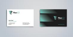
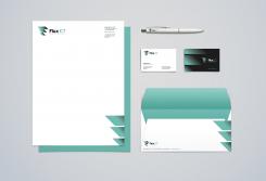
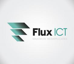
Thank you for the previous feedback. Ive tried to incorporate the phi symbol with a digital feel.
Corporate identity and logo ICT company
- Contest holder: stef.schenkelaars
- Category: Logo & stationery
- Status: Ended
Start date: 13-07-2015
Ending date: 01-08-2015
It all started with an idea...
A short, interactive guide helped them discover their design style and clearly captured what they needed.
Brandsupply is a platform where creative professionals and businesses collaborate on unique projects and designs.
Clients looking for a new logo or brand identity describe what they need. Designers can then participate in the project via Brandsupply by submitting one or more designs. In the end, the client chooses the design they like best.
Costs vary depending on the type of project — from €169 for a business or project name to €539 for a complete website. The client decides how much they want to pay for the entire project.
The concept behind this idea is the 'Flow of a physical property in space.'
Hmm, it is better than te last one but I am not really convinced. Maby change the F u mn into a phi? Just an idea.
No comments
Vind het kleurverloop in die strepen een beetje raar. Verder ok
 Nederland
 België
 France
 Deutschland
 Österreich
 International
