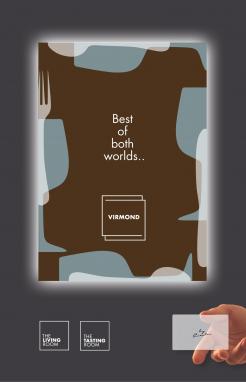
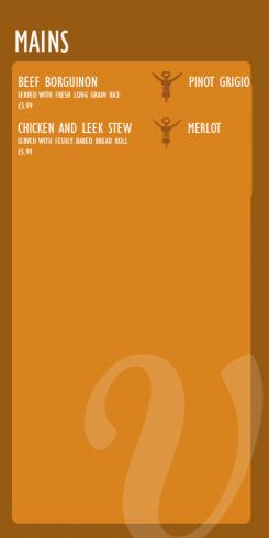
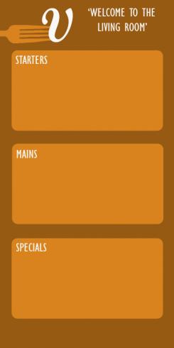
I also reworked the menu format to make it simpler. As you can see each dish as a recommended wine to the left highlighted by the corkscrew symbol.Should get approx ten dishes on this side. with a bifold format menu we can easily fit 20 dishes and have room on the back for further info if you wish
Lettering/logo and menu template for restaurant
- Contest holder: mvirmond
- Category: Logo & stationery
- Status: Ended
Start date: 07-07-2013
Ending date: 31-07-2013
It all started with an idea...
A short, interactive guide helped them discover their design style and clearly captured what they needed.
Brandsupply is a platform where creative professionals and businesses collaborate on unique projects and designs.
Clients looking for a new logo or brand identity describe what they need. Designers can then participate in the project via Brandsupply by submitting one or more designs. In the end, the client chooses the design they like best.
Costs vary depending on the type of project — from €169 for a business or project name to €539 for a complete website. The client decides how much they want to pay for the entire project.
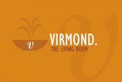
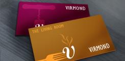
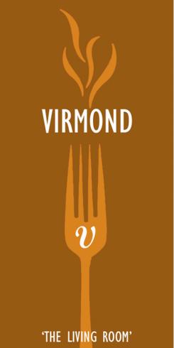
I also reworked the living room logo. Replaced the fork with the dish to fit in more appropriately with your menu. Replaced the flames also with softer steam lines. Hope you like the improvements
Hi
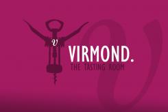
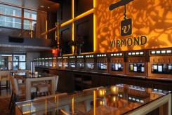
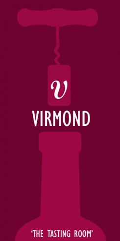
Following your feedback i have reworked my proposal. ditched the old style corkscrew for a more modern style to help lose the traditional vide. This image also shows how it can work horizobtally for your windows and business cards etc.
Kind Regards
Anthony
This image shows how the logo could work in a window, also had a play around with colour varaitions to show you what can be achieved.
Hi agagin,
i have created some more imagery to help vusualize how my proposal can be utilized. Hope you like them
very nice!
Here is the back view of the virmond living room menu. Depending on the size of the menu/variet of dishes on offer we may b=nned to go for a differnt menu format (open up style) dpending on the content to go in the menu itself, but this should give you an idea of whats possible with this propsoal. Agaion any feedback would be greatly appreciated
Anthony
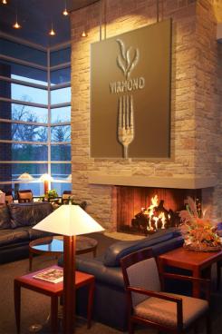
Here is my proposal for the virmond living room. I went for a a format/layout that tied in with the tasting room but used fork imagery instead. You said you serve hearty food and that to me conjures images of hot food hence the steam imagery. Once again the 'V' is incorporated. i went for a warm rustic colour but again this can be adapted to suit.
i like your thoughts on this.
two issues here: this is a place which will mostly feature spoons, rather than forks. and the flame is not really the right association (although I can see where you are coming from). it reminds me too much of an open grill I guess.
also, again, the vertical format is less than ideal.
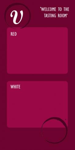
Here is a draft of the back of the wine menu. I went for wine stain imagery so the imagery was subtle on this side as not to take away from the content
a bit too playful - could be slightly simpler and more classic
also, the format needs to have space for quite a few items
Hi,
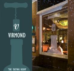
Please find attached my proposal for virmond tasting room. Ive gone for a rustic old fashioned corksrew with the 'V' symbol on the cork. I think the V is simple but distinctive and can be the theme of the whole project. With the colour i went again with rustic deep shade, but the colour can be adapted to suit easily depending on your preference. I hope you like it. Feel free to feedback if possible
Kind regards,
Anthony
great design - thanks a lot.
I like the simple design and clear shapes.
Maybe a bit too much on the traditional side (with this old school cork screw), but still very nice overall.
the vertical design poses a bit of a problem as my windows only have a narrow horziontal area for printing.
the name is "Virmond.", not "Virmond", by the way.
Great. Thank you so much for your feedback. I have a few ideas as to how I can get over the horizontal window issue and some ideas to make the proposal less traditional also. I will get back to it ASAP. Thanks again
 Nederland
 België
 France
 Deutschland
 Österreich
 International
