No comments
Creation of a logo and a visual identity for a hall(market) of fruits and vegetables
- Contest holder: PRIMEUR
- Category: Logo & stationery
- Status: Ended
Start date: 27-08-2013
Ending date: 24-09-2013
It all started with an idea...
A short, interactive guide helped them discover their design style and clearly captured what they needed.
Brandsupply is a platform where creative professionals and businesses collaborate on unique projects and designs.
Clients looking for a new logo or brand identity describe what they need. Designers can then participate in the project via Brandsupply by submitting one or more designs. In the end, the client chooses the design they like best.
Costs vary depending on the type of project — from €169 for a business or project name to €539 for a complete website. The client decides how much they want to pay for the entire project.
Hello!
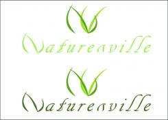
I combine the leafs to get shape of the logo.
If you like the idea please post your opinion.
Greetings.
Hello
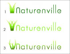
This is idea with grass implant.
Hello V_01,
thnak you for the new suggestion. The police is round, readable, but lacks a bit of originality.
The link between the grass and the text is not clearly obvious.
Best regards,
Hello!
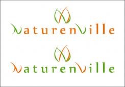
I'v changed the direction of letter "V" in the font, and I think it looks much better now than before. I changed the font and the first letter "N".
Please let me know your opinion.
Apology
I change letter "V" in the logo. Mistake in writing.
Hello V_01,
some comments concerning the new proposal:
-the font, it is a too stylised for us. if it is too much stylised, the customer will not read correctly the text.The text must be clear, even the police is a little bit original.
-the idea of the grass for the logo is pretty good, but the shape of the logo does not look "natural", we mean concerning the implantation of grass.
Can you make other tries? Thank you
Ofcourse I can.
Of course I can.
No comments
Hello V_01
Thank you for your participation.
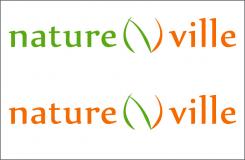
We really appreciate the idea with the grass. It is very simple and clear.
Please find below our comments:
Concerning the logo:
-resize the logo, in order to be proportional to the text
- N and V are not distinctive enough: use different colors
Concerning the police:
Change the font, it is a little too classic
No line under the word city
Only one color
We ask you to continue working in this idea, with three possible directions:
1 - Styling "N" of nature and "V" of ville (like the second try). But the size of stylised letters should be the same as the other letters
2 - Styling only the N between nature and city, return with logo, but the size should be the same as the other letters
3-text simple, with the reworked logo above
Waiting for your new designs.
Thank you
Hello V_1,
we definitly prefer this one. Please make some modifications according our comments:
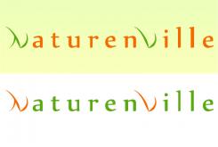
-Just stylise the "N" at the beginning of the word "Naturenville". not the "V". The "N" must look like grass, like in the logo or similar
-we do not want two colours for the text: just one color (not the orange)
-please make a try with different fonts. We do not appreciate the chosen font
Concerning the logo, keep using green colors.
How the logo looks like whether the direction of the "V" would be changed"?
 Nederland
 België
 France
 Deutschland
 Österreich
 International
