Hi @jaboer, thanks for your feedbacks, here is the new version. I decided to keep the H in the main text because the H pictogram may not be enought to read the word properly.
A litter project which needs a fresh warm corporate identity and logo
- Contest holder: jaboer
- Category: Logo & stationery
- Status: Ended
- Files: File 1, File 2, File 3
Start date: 01-10-2019
Ending date: 22-10-2019
It all started with an idea...
A short, interactive guide helped them discover their design style and clearly captured what they needed.
Brandsupply is a platform where creative professionals and businesses collaborate on unique projects and designs.
Clients looking for a new logo or brand identity describe what they need. Designers can then participate in the project via Brandsupply by submitting one or more designs. In the end, the client chooses the design they like best.
Costs vary depending on the type of project — from €169 for a business or project name to €539 for a complete website. The client decides how much they want to pay for the entire project.
Clic on left thumbnail to display it full resolution.
@jaboer : Let me know if it's ok so i can keep on working on business card and letterhead.
Hello Axel, Thanks for your effort, you were very close with your H(G) as a wave. We have made our choise. Thanks again.
Hello @jaboer
As you requested it, here is another design based on both H & G letters. I kept the main concept of the wave and i had a leaf to replace the drop.
Let me know if i am in the right direction.
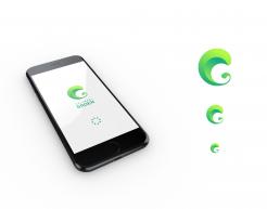
Hello Axel, The H (and G) look good. Can you make it an app icon as an example, too? And position 'elemaalGroen' to the right of the H on the horizontal axis?
Hello Axel, The H (and G) look good. Can you make it an app icon as an example, too? And position 'elemaalGroen' to the right of the H on the horizontal axis?
Hello Axel, The H (and G) look good. Can you make it an app icon as an example, too? And position 'elemaalGroen' to the right of the H on the horizontal axis?
Hello @jaboer
As you requested it, here is another design based on both H & G letters. I kept the main concept of the wave and i had a leaf to replace the drop.
Let me know if i am in the right direction.
Hello @jaboer
As you requested it, here is another design based on both H & G letters. I kept the main concept of the wave and i had a leaf to replace the drop.
Let me know if i am in the right direction.
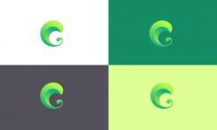
Hello @jaboer, here is my design with this simple and pure G letter pictogram.
My concept is the Wave : people are like a wave , cleaning and refreshing everything in its pathway. We also can see a drop in the pictogram : one drop + one drop can be a wave (an ocean) if everybody "plays the game".
Pictogram can be easily used on its own , for app icon, social media icons, splashscreen etc...
Color can bet set according your preferences.
Font can also be changed according your wishes.
Hello @jaboer, here is my design with this simple and pure G letter pictogram.
My concept is the Wave : people are like a wave , cleaning and refreshing everything in its pathway. We also can see a drop in the pictogram : one drop + one drop can be a wave (an ocean) if everybody "plays the game".
Pictogram can be easily used on its own , for app icon, social media icons, splashscreen etc...
Color can bet set according your preferences.
Dear Axel, I lijke your thought but I prefr a H as a wave design. But how?
Hi, i can make another attempt with a H for the wave.
I'll post it as soon as possible.
Thanks for your feedback!
Hello @jaboer, here is my design with this simple and pure G letter pictogram.
My concept is the Wave : people are like a wave , cleaning and refreshing everything in its pathway. We also can see a drop in the pictogram : one drop + one drop can be a wave (an ocean) if everybody "plays the game".
Pictogram can be easily used on its own , for app icon, social media icons, splashscreen etc...
Color can bet set according your preferences.
 Nederland
 België
 France
 Deutschland
 Österreich
 International

