No comments
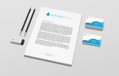
A logo & corporate identity for an innovative dental webshop
- Contest holder: autoklaven-shop
- Category: Logo & stationery
- Status: Ended
Start date: 24-07-2014
Ending date: 15-08-2014
It all started with an idea...
A short, interactive guide helped them discover their design style and clearly captured what they needed.
Brandsupply is a platform where creative professionals and businesses collaborate on unique projects and designs.
Clients looking for a new logo or brand identity describe what they need. Designers can then participate in the project via Brandsupply by submitting one or more designs. In the end, the client chooses the design they like best.
Costs vary depending on the type of project — from €169 for a business or project name to €539 for a complete website. The client decides how much they want to pay for the entire project.
No comments
Thank you for your redesign! We think it is a very clear improvement. Yet, we think that the Autoklaven shop is too big/heavy, could you make it smaller/lighter (maybe align it with the circle instead of the square)? Also, we would like to see if you could put the focus on the 'autoklaven' while the focus is now on the logo on the left. Can you do something with this? :)
I will post a new version. In this one I've used anonther font (oswald) which is less height consuming. Furthermore I aligned AUTOKLAVEN with the three arrows to reduce the weight of the text. To get focus on AUTOKLAVEN I used the same color of the circle. Hope you like it. And - before I forget it - thanks for your constructive feedback. Regards, Martin.
No comments
That is already better. I think the "sterilizer systems" is not necessary to put there, could you remove it? Looking forward to the next version!
Next version is coming up!
No comments
Dear gopoa, thank you for your input!
We really like how you used the three arrows that symbolise that it can be sterilized, we did not think of that, thank you! We also like that it is horizontally oriented which is easier to use in our webshop. We would like the logo to be more minimalstic. Also we don't like the font, it feels a bit to 'heavy' while we are flexible, simple and young. Can you do something with this feedback? :)
Dear autoklaven, thanks for your constructive feedback. I really appreciate it. I will post another version with a lighter, more modern font and a horizontal approach. Besides, I deleted the glare on the logo to give it a more minimalistic feeling. Hope you like it. Regards, gopoa.
 Nederland
 België
 France
 Deutschland
 Österreich
 International


