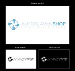
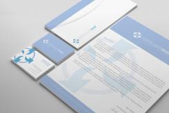
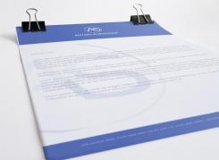
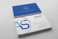
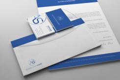
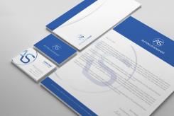
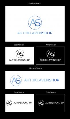
Hi. Thanks for your feedback. Here´s the design with a thiner font. Give me your feedback. Thanks
A logo & corporate identity for an innovative dental webshop
- Contest holder: autoklaven-shop
- Category: Logo & stationery
- Status: Ended
Start date: 24-07-2014
Ending date: 15-08-2014
It all started with an idea...
A short, interactive guide helped them discover their design style and clearly captured what they needed.
Brandsupply is a platform where creative professionals and businesses collaborate on unique projects and designs.
Clients looking for a new logo or brand identity describe what they need. Designers can then participate in the project via Brandsupply by submitting one or more designs. In the end, the client chooses the design they like best.
Costs vary depending on the type of project — from €169 for a business or project name to €539 for a complete website. The client decides how much they want to pay for the entire project.
I can´t send more designs because the limit of designs to send is 15 and i achieve it
No comments
Thank you for your improving input! We like the second one of this image best. We like how you made the 'sterilizable' abstract. We would like to ask you if you could experiment more with the font: we feel it is a bit heavy and would like it to be more light to express our flexibility, simplicity and young-ness. Can you do something with that?
logo2
Thank you for your redesign! We would like to ask, what does the logo symbolize? We would like the focus to be on Autoklaven while it is on shop at the moment, and could you drop the 'sterilizer systems'?
I´ve google it for Autoklaven and i get some machines. My idea is to the logo symbolize cleaning ( the arrows symbolize the air) something like that.
I´ve google it for Autoklaven and i get some machines. My idea is to the logo symbolize cleaning ( the arrows symbolize the air) something like that.
If you have some ideias, please send to me. Do you want to remove the 'sterilizer systems' tagline?
I get the idea, but it does not feel clear to us. Indeed, we would like you to remove the tagline :)
In the following image the middle image means that the object can be sterilized. Maybe you could use the three arrows/waves?
http://www.wh.com/mam/images/whcom/global/dental-newsroom/reports-and-studies/restoration-prosthetics/thermodesinfizierbar-icon.jpg
Logo Design
Dear kabedifernando, thank you for your input!
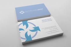
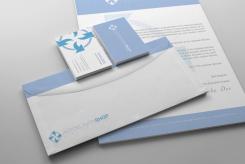
We love how you presented the logo and the minimalistic style of the writing documents. For example, the business card looks very nice with showing a part of the logo in the design.
We are not that fond of the logo. It feels more like a car or chemical logo (I think it's the circle that does that). We would like the logo to be more horizontal oriented and more minimalistic. We also feel that the blue is a bit too dark and that gives it a slight old-fashioned appeal.
Can you do something with this feedback? :)
Thanks for your feedback. I will work on it
 Nederland
 België
 France
 Deutschland
 Österreich
 International
