No comments
A new company that helps start-up companies in the medical device industry to develop their products
- Contest holder: hansmeijs@upcmail.nl
- Category: Logo & stationery
- Status: Ended
- Files: File 1, File 2
Start date: 12-06-2012
Ending date: 20-06-2012
It all started with an idea...
A short, interactive guide helped them discover their design style and clearly captured what they needed.
Brandsupply is a platform where creative professionals and businesses collaborate on unique projects and designs.
Clients looking for a new logo or brand identity describe what they need. Designers can then participate in the project via Brandsupply by submitting one or more designs. In the end, the client chooses the design they like best.
Costs vary depending on the type of project — from €169 for a business or project name to €539 for a complete website. The client decides how much they want to pay for the entire project.
Two important things to remember when designing the logo of your company:
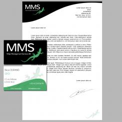
- You provide a large range of services => Then the idea of a logo with multiple colors is interesting. There I tried not to fall in the trap of creating a full color logo we could find in the 90s. I sticked to eight distinct colors. They are placed like a swatch to illustrate the fact you provide a kind of swatch of services. The rhombus form give an idea of dynamic and direction toward the diferent goals of these companies.
- The second point is that it is for a medical domain so White and clear shape/font is necessary. That is why I chose to do a white gecko instead of a colorful gecko (and it is also more neat and clear this way) and used a font really visible. I am confident in the fact that everyone will remember this logo easily.
Mooi bedacht! Aantrekkelijke kleuren en schikking. Meijs is wel verkeerd geschreven, maar dat is een detail.
 Nederland
 België
 France
 Deutschland
 Österreich
 International


