Dear Sir / Madam,
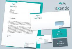
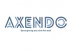
Again, the lines symbolize the synergy between Axendo and their client(s). With the "open" letter is also the 'transparent' method of working supported. Of course, other variants of color usage is possible.
I'm looking forward to your reply,
With kind regards,
Kees van Beek
Axendo brand redesign
- Contest holder: Axendo
- Category: Logo & stationery
- Status: Ended
- Files: File 1, File 2, File 3
Start date: 14-02-2013
Ending date: 21-03-2013
It all started with an idea...
A short, interactive guide helped them discover their design style and clearly captured what they needed.
Brandsupply is a platform where creative professionals and businesses collaborate on unique projects and designs.
Clients looking for a new logo or brand identity describe what they need. Designers can then participate in the project via Brandsupply by submitting one or more designs. In the end, the client chooses the design they like best.
Costs vary depending on the type of project — from €169 for a business or project name to €539 for a complete website. The client decides how much they want to pay for the entire project.
Dear Sir / Madam,
Attached a new logo proposal. This designs contains also the transparant working method. Except, in this proposal is the 'transparancy' captured by 'Do'. Doing business together in a transparant, open and hardworking way.
I'm looking forward to your response.
Sincerely,
Kees van Beek
Dear Sir / Madam,
Attached is a variant of the previously proposed logo design.
I'm looking forward to your reply.
Sincerly,
Kees van Beek
Dear Sir / Madam,
Attached my logo proposal. A brief explanation, each letter of the name Axendo consists of 2 colored lines. A dark one and a light line. These 2 lines symbolize the cooperation (synergy) between Axendo and their client(s). With the "open" letter is also the 'transparent' work supported. Of course, other variants of color usage is possible.
I'm looking forward to your response.
Sincerely,
Kees van Beek
 Nederland
 België
 France
 Deutschland
 Österreich
 International
