No comments
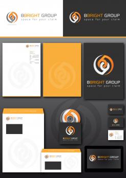
Bbright Group
- Contest holder: Jeroengoes
- Category: Logo & stationery
- Status: Ended
Start date: 23-07-2015
Ending date: 22-08-2015
It all started with an idea...
A short, interactive guide helped them discover their design style and clearly captured what they needed.
Brandsupply is a platform where creative professionals and businesses collaborate on unique projects and designs.
Clients looking for a new logo or brand identity describe what they need. Designers can then participate in the project via Brandsupply by submitting one or more designs. In the end, the client chooses the design they like best.
Costs vary depending on the type of project — from €169 for a business or project name to €539 for a complete website. The client decides how much they want to pay for the entire project.
Zoals beloofd. mvg
Ik zie nu pas deze beoordeling! Hartstikke fijn, bedankt! Mvg
https://www.google.com/search?tbs=sbi:AMhZZit-rHSxH49n10Q9m200hCCxKlezWyYOgQY_1DjWryV7WAg1L3QEurpcmd6X0c5uZQSBEIDXkZG6npd24B75IEnTj1EtS5IVjlmWB-Vr_1z9A70PE3hRVyZTDnaOyKn4kzsPfTDV-p4Qahn1BnOeALLNELr_1P4Au3YXKqm6mxMUOCHogx06Sw4-24nTd6OvZP-a6lMnPiyjm5HnV7XgN8o2g-aVY2-wtFl7DXyGpT_1RwnfzysVNmaaiwz-n4N2ZOdWrPUEYlBBEDOVXYbVSAFBe40BEaCzpBXjaQhtQx3WOXBzCPW5xpNoYnJPmqa60m_1Csf9o8Ra-QyA3vxywHZSvvMBHsMVkH_1e48VYibElBqgC5inTI6FPGOuz7D_1i0tuoHMS2C78wBnTizyA_1DGkBMOnvzGkY_1AIV8G9pXH3VBhwz2WrL-SkhRaoD-ZvbLAkLXgBvj1n7Lw6H1MIusjIuwAAhKijgBsTDXzO4OSIWSJvULHMBYwr7Byd7AKfg0mMjMdL7TCADTJ9unBSM7a5l4TefO1O5koGPpzJPF39MJRqfJ8--c94aCgCbs-yc0Dr1NPPpedp-8eNSv9gW7xk4pTyp4vS8lxOdd9H9VhjYROB0exTb6dna-2IjV6lrvlhq8x-0icKCGgXiC1QazCyuvp9cgeWRDsd6bpgth0bHxSkPXrDjos4svb5-GNuzwO1_1R0gRy1aBuznn3RDHJOgCLGJOoX4QysVghG808IAnwZU92Bw6AUjG668ai0ADmlb--DDptoRZmug65dh4HsD-Ra5ZOJsVfvheC8WCRGH5AfLzd7ts85oVIB5pPKZlczZ7-Bm2uYEu0VuRmVr74J8SGfcQRsNe3LNFuDar8jRCTVT0EvSN1cCqNLjXMGvYtkUy4oBCXRMbY
fedora icon
Look with a more professional eye, instead of a jalous one. It's about the two B's and the + in the middle.
No, I'm not jealous, your explanation is absurd, your work pure plagiarism as most of your work is, unfortunately the work of a purchaser. That's the proof of your uncrativity . However, copying others work, now, that's something your good at, and that is the absolute truth, I don't want to hear about the B's and the plus, don't make me laugh ! This work is fundamentally and thoroughly stolen !
P.S. The reason why you make pictures that are hardly even visible is to hide that they are stolen !
If Jeroen wants to see the development from the start to end of my logo that's always possible, because I made it myself, also the plus idea. Font of the B is Danube. For now, I don't have to give you more explanation. I support my design or 100%. Your problem and energy if you think otherwise.
O:) !!!
Hierbij alvast de aangepaste versie. mvg
 Nederland
 België
 France
 Deutschland
 Österreich
 International


