Hello,
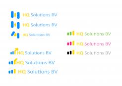
On the top left side I've been playing around with the prior logo, trying to solve the g/q - issue.
On the bottom left side you'll find some designs that illustrate "High Quality".
And to the right I'd like to give you different colour-versions to choose from.
With kind regards,
Urban Grau
BV
- Contest holder: Jan
- Category: Logo & stationery
- Status: Ended
Start date: 26-09-2013
Ending date: 02-11-2013
It all started with an idea...
A short, interactive guide helped them discover their design style and clearly captured what they needed.
Brandsupply is a platform where creative professionals and businesses collaborate on unique projects and designs.
Clients looking for a new logo or brand identity describe what they need. Designers can then participate in the project via Brandsupply by submitting one or more designs. In the end, the client chooses the design they like best.
Costs vary depending on the type of project — from €169 for a business or project name to €539 for a complete website. The client decides how much they want to pay for the entire project.
Thanks but not realy what i am looking for, sorry
Hello,
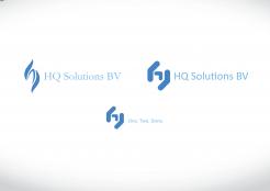
As you can see I've been creating two versions of the logo. A rather playfull one - dynamic lines and a seriphe font - and a straight one - defined lines with an obscure font.
The logo itself illustrates the core moment of your work - translating/converting from one style/component to another - while forming the letters 'h' & 'q'.
I've also added an optional slogan at the bottom.
Hello,
Thank you for your designs. I rather like the second more straight one, but the letter Q seems to be transformed in to a G. Can you work on this?
The logo looks rather technical. Can you transform the image in to a picture that represents High Quality solutions instead of the usage of the letters H and Q.
Thank you,
With kind regards
 Nederland
 België
 France
 Deutschland
 Österreich
 International


