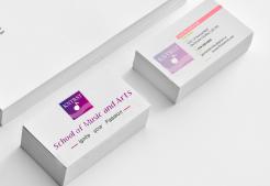
Copy logotype number one (1) put on documents
Corporate Identity and Logo design for yound and dynamic Coaching & Training's Institute in Amsterdam
- Contest holder: Robbiieerob
- Category: Logo & stationery
- Status: Ended
Start date: 14-06-2013
Ending date: 14-07-2013
It all started with an idea...
A short, interactive guide helped them discover their design style and clearly captured what they needed.
Brandsupply is a platform where creative professionals and businesses collaborate on unique projects and designs.
Clients looking for a new logo or brand identity describe what they need. Designers can then participate in the project via Brandsupply by submitting one or more designs. In the end, the client chooses the design they like best.
Costs vary depending on the type of project — from €169 for a business or project name to €539 for a complete website. The client decides how much they want to pay for the entire project.
Copy logotype number one (1) put on a Business(Calling) Card
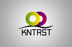
Copy logotypenumber two (2) put on documents
Copy logotype number two (2) put on a Business(Calling) Card
DESCRIPTION
The representational elements:
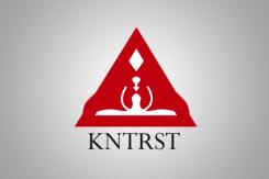
· 1/We have in this logo two human beings' heads which face to symbolize the artistic thought, the creativity, the love, the discussion
· 2/The triangle with its three points of extremities represents the opening, the agreement, the division(sharing) of the company.
· 3/If you consider good in the middle of both human beings' heads you go to perceive a shape of guitar that I drew to represent the musical creativity.
· 4 / La used typography(typeface) is by default in all the systems of Windows, he(it) is simple, fascinating and attractive.
The description of this logo is the same that the second.
I just changed the symbol which was in the middle by adding it a guitar to suggest the musical, artistic creativity.
Hello !
DESCRIPTION:
The representational elements:
The pink color is the axis symbolizing the creativity, the beauty, the purity, the division(sharing), the opening and the freedom.
The color moves assure(insure) a maximum legibility of the characters, It is a security of modernity.
The used typography(typeface) is by default in all the systems of Windows, he(it) is simple, fascinating and attractive.
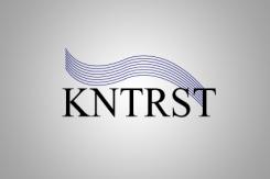
1/The symbol in the middle represents the musical as well as artistic creativity, it clears(releases) a maximal purity of the mark(brand), it gives him(her) a unique(only) and attractive identification.
2/lines below the symbol represents the artistic training(formation), they suggest a diversity in the art that is they suggest all the words which define the art such as the freedom, the thought, the creativity, the love, the life...
The visual identification of the company KNTRST is the result(profit) of an artistic work which emphasizes, in a particular way, the following elements: the name of the company, her mission (target), its purity, its peculiarity a typographic style, symbols and distinctive colors.
It is the symbolic representation of the company. It becomes the expression of its image, its trademark, its identification. He has to vibrate by his design, the strength of his symbols, his colors. He(it) creates a link of pride, membership, reunification.
The typographic signature cannot be translated. The visual identification has to throw(plan) a coherent image of the organization. To protect the image of the company and to spread(broadcast) it is a responsibility which must be shared by all the members
Colors
The grey
The grey color:
· Security of seriousness
· Suggestive of the simplicity, the modernity
· The grey is not color playful: he(it) is synonymic of seriousness and sobriety. He(it) is a member(part) of dark colors which we choose as an elegant suit(costume), a tailor(suit), for an official car. The color is a mark(brand) of the professionalism, the adulthood, when the yellow or the blue(bruise) evoke a more childish and cheerful universe.
· The grey suggests besides the universe of the modernity, the simplicity and the technologies. It is the contents which corresponds completely to the job(business) by the mark(brand) " KNTRST " and which creates a considerable homogeneity.
The symbol is of red color. The choice of the color is not neutral: the red color carries(wears) two main symbolic values
 Nederland
 België
 France
 Deutschland
 Österreich
 International
