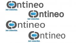
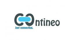
Four different fonts and two different versions of the logo. Effects can be added. Are this versions better?
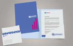
CREATIVE LOGO + STATIONERY FOR NEW SOCIAL MEDIA COMPANY!
- Contest holder: Contineo
- Category: Logo & stationery
- Status: Ended
Start date: 10-08-2013
Ending date: 26-08-2013
It all started with an idea...
A short, interactive guide helped them discover their design style and clearly captured what they needed.
Brandsupply is a platform where creative professionals and businesses collaborate on unique projects and designs.
Clients looking for a new logo or brand identity describe what they need. Designers can then participate in the project via Brandsupply by submitting one or more designs. In the end, the client chooses the design they like best.
Costs vary depending on the type of project — from €169 for a business or project name to €539 for a complete website. The client decides how much they want to pay for the entire project.
ENG:It is rather hard to explain, but we think the name is not readable properly due to the "O" which has become an inverted C. Besides that, the "linking-message" is not clear enough.
NL: Het is moeilijk uit te leggen, maar we denken dat de naam niet meer goed leesbaar is door de "O" die nu een omgedraaide "C" is geworden. Daarnaast komt de "verbinding-boodschap" niet helemaal over.
No comments
This smaller links are even better than the other two. We don't have an opinion about the shadings since we don't like the font.
Thanks for the submissions, we are looking forward to the redesign!
The single parts can be used alone, so for example you use the logo without the slogan or the whole name.
ENG: Could you connect the C and the O with this style of "links" We like this more. Again the font is not our taste.
NL: Zou je de C en de O met elkaar kunnen verbinden met deze soort schakels, deze heeft onze voorkeur. Ook hier vinden we het lettertype niet zo mooi.
Ok, I will change the font. You mean, I should use this logo without the "c"?
No, we liked the C being connected, however the "links" in this design had a nicer shape than the previous one. So perhaps combine them somehow.
No comments
ENG:Dear Designer,
thank you for submitting your design in the contest! We think your idea of connecting the C with the O is nice, however the font you are using is perhaps to creative. Besides that we think that when you make the blue bigger, so it nearly touches the "C" and the "O" it also looks a lot better.
NL:Beste designer,
Bedankt voor je bijdrage aan de wedstrijd! We vinden het idee van de C en de O met elkaar verbinden een leuk idee, echter vinden we het lettertype wellicht iets creatief. Daarnaast denken we dat het mooier is wanneer de blauwe schakel iets groter is zodat het bijna de C en de O raakt.
 Nederland
 België
 France
 Deutschland
 Österreich
 International
