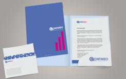
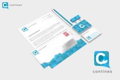
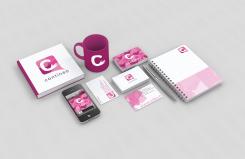
blue style
CREATIVE LOGO + STATIONERY FOR NEW SOCIAL MEDIA COMPANY!
- Contest holder: Contineo
- Category: Logo & stationery
- Status: Ended
Start date: 10-08-2013
Ending date: 26-08-2013
It all started with an idea...
A short, interactive guide helped them discover their design style and clearly captured what they needed.
Brandsupply is a platform where creative professionals and businesses collaborate on unique projects and designs.
Clients looking for a new logo or brand identity describe what they need. Designers can then participate in the project via Brandsupply by submitting one or more designs. In the end, the client chooses the design they like best.
Costs vary depending on the type of project — from €169 for a business or project name to €539 for a complete website. The client decides how much they want to pay for the entire project.
Hello,
You right i did not understand what you meant.
So here is another version.
Sincerely
Wilko
No comments
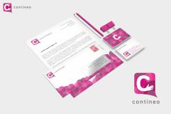
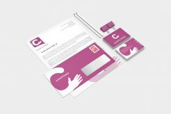
ENG: We liked the business card with the different shades of pink more. The envolope becomes somewhat pink maybe?
NL: We vonden de vorige business card beter met de verschillende tinten roze. De envelope is wellicht iets te roze.
Hello,
I am glad you like my design. Here is another version with the color you like.
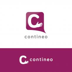
ENG: Hi, we think there is a miscommunication. We liked the fact that there were 4 different shades of pink in the logo. The thing we dislikes was the fact that most shades looked kind of gray.
Yours
NL: We denken dat er een miscommunicatie was. We vonden de 4 tinten roze leuk in één logo. Wat we niet mooi vonden is dat de tinten nogal grauw werden.
Groetend
No comments
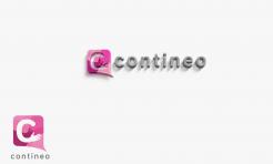
ENG: We like the logo, but dislike the 3d effect. We have the same feedback about the colours with this submission.
NL: We vinden het logo mooi, maar vinden het 3D effect niks. Verder hebben we hier dezelfde feedback over de kleuren.
Hi,
This is my work for your new visual identity.
I am waiting for your feedback.
Sincerely
Wilko
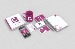
ENG: Hi Wilko,
thank you for the submission, it actually looks really nice! We would only like to see the colours ( or one of them) to be more bright. Like you use with the cup.
Thanks for the submission!
Regards
NL: Hallo Wilko,
Bedankt voor je inzending, het ziet er aardig gelikt uit. We hadden alleen graag dat de kleuren( of tenminste één ervan) er meer uit springen. Ongeveer wat je met de mok gedaan hebt.
Bedankt voor de bijdrage!
Groetend.
 Nederland
 België
 France
 Deutschland
 Österreich
 International
