No comments
Design a logo and corporate identity for a new dynamic motorcycle sales company
- Contest holder: TvdMolengraaf
- Category: Logo & stationery
- Status: Ended
Start date: 14-01-2016
Ending date: 25-01-2016
It all started with an idea...
A short, interactive guide helped them discover their design style and clearly captured what they needed.
Brandsupply is a platform where creative professionals and businesses collaborate on unique projects and designs.
Clients looking for a new logo or brand identity describe what they need. Designers can then participate in the project via Brandsupply by submitting one or more designs. In the end, the client chooses the design they like best.
Costs vary depending on the type of project — from €169 for a business or project name to €539 for a complete website. The client decides how much they want to pay for the entire project.
No comments
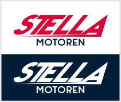
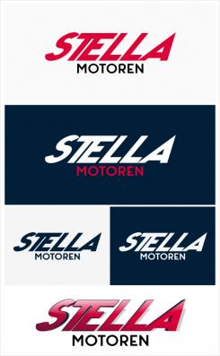
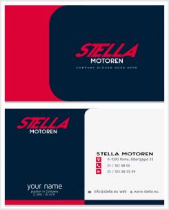
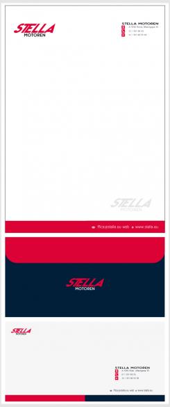
Hello, this is my vision of your logo. I have used more subtle colors but still strong, mat colors. And I tried not to use black knowing that it's really common to see it in a logo. Italic position with connected TE gives the idea of speed and at the same time makes connection with your business. I have on purpose made the edges sharp symbolically represents " mountains" on challenge of driving. I have made as well a 3D vector showcase of the logo just to show the possibilities of variations. And this are elements for your corporate identity with as low as much details so that they don't hold the focus of your logo.
Kind regards,
Sonja
 Nederland
 België
 France
 Deutschland
 Österreich
 International
