No comments
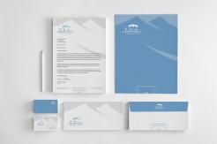
Design a logo and stationery for our new-style-church
- Contest holder: fharmusial
- Category: Logo & stationery
- Status: Ended
Start date: 15-07-2013
Ending date: 15-08-2013
It all started with an idea...
A short, interactive guide helped them discover their design style and clearly captured what they needed.
Brandsupply is a platform where creative professionals and businesses collaborate on unique projects and designs.
Clients looking for a new logo or brand identity describe what they need. Designers can then participate in the project via Brandsupply by submitting one or more designs. In the end, the client chooses the design they like best.
Costs vary depending on the type of project — from €169 for a business or project name to €539 for a complete website. The client decides how much they want to pay for the entire project.
Vuk, thanks ... indeed ... that is what I meant .. the competition just started ... thanks for the effort so far ..
I thought it over once more and decided to give this a two star after all. I feel that in general, your strength is in the typographical composition. the logo is not bad as part of the overall composition, but I can not use it separately as it's too dark and lacks any subtle references to meeting and/or family.
No comments
something like this?
and my name is Vuk :)
sorry Vuk :-) ... and almost ... actually more like this ...
http://www.xaraxone.com/webxealot/workbook19/cube_02.gif
No comments
vut, thanks once more, how about slightly modifying the hexagonal shape surrounding the cross by adding white hairlines, to give it the appearance of a 3D cube shaped tent. Furthermore a tad of tabernacle colors (not necessarily in the cube itself) might help to add just a little bit more symbolism, but also livelihood to the logo ..
http://1.bp.blogspot.com/-oGpYF6bqR8w/TxzKpoVw3iI/AAAAAAAAEpQ/rqwjRublGaw/s640/Tabernacle+First+Covering+Cherubim+1-4.jpg
No comments
thanks vut, this helps to form an idea, was not my intention to stimulate active copying though :-)
No comments
I like your first design as best, you do seem to use some archaic (and existing) symbols, I am wondering how your first design would look like if you would replace the russian orthodox cross, with the symbol from e.g. PinCarel's first design
i really can't find the ''e.g. PinCarel'' symbols
im sorry, i didn't see that this is participating in contests
It's interesting that you, especially as people related to church, tolerate stealing other's people design, and even suggest it.
elizaveta, i see your point, but part of the setup of brandsupply (public) is that peoples design are exposed, it will be difficult not to be influenced by other peoples design and I see that as an advantage (but pure copying is of course different matter).
this is not my fault, I thought that was approved by the designer
No comments
.. could still work with (cross) symbol on top ..
.. the russian orthodox cross, apart from the association with Christ, does (somehow) convey associations to real and pure and even power, but can do little to make clear that we see the church as a family
 Nederland
 België
 France
 Deutschland
 Österreich
 International
