Design a Logo for a Burger Take-away and Menu

Start date: 02-02-2015

Ending date: 09-02-2015

Total budget: € 250.00
Latest design
Book cover
ThomasCival

It all started with an idea...

A short, interactive guide helped them discover their design style and clearly captured what they needed.

Needs


We are looking for a simple yet business-like logo for the take-away (to be used also on merchandise such as our cups, T-shirts, packaging etc.), as well as a menu lay-out and business cards.

IMPORTANT:
-no clipart logos that one can just easily find via google;
-we are looking for something memorable
-simple does not mean simplistic
-the symbol of Hambrugeria does not necessarily have to be a clipart burger (an Apple logo of the computer is not an apple company!)
-we look for a creative and innovative design

Company description


We are opening our first hamburger take-away place called Hamburgeria (in a series of several over the next 2 years). The concept of our place focuses on offering customers a proper hand-made burger, not the typical fast-food burger with processed meat. All our burger ingredients are fresh with no added colors, preservatives, no GMO, no MSG; as well as a variety of different fresh buns. Besides offering customers a healthy choice, we are also an environmentally-friendly business.

Target group


the usual customers of a healthy take-away

Colors, favourites and other requirements


-no animal inspired logos;
-SIMPLE, FRESH, INSPIRED, TASTY - are some keywords to start with;
-if you wish you can think of a symbol that would represent our business;
- we have a preference for black color, we find that it always goes good with other colors: yellow, green, red or orange
- the source of inspiration for our burger recipes were our travels to different parts of the world, hence each burger comes from a different country!
- the menu offers a selection of beef, chicken, lamb, vegetarian and 50/50 burgers
- besides the burgers the menu will contain: snacks&sides, drinks, desserts
- we will have a two-sided menu (same menu in 2 languages)

Designer: V. V.
logo_huisstijl-v-15022-VkbCTaXw

No comments

SandoriBVSandoriBV

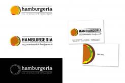
Here, we really enjoyed the logos in the second row.
-they look a bit like for a hotel
-maybe to place the name in a straight line? not a wave?
-the H is great, but maybe to transform it into less hotel-like?

This contest is finished. Its not possible to reply anymore.
logo_huisstijl-v-15022-5nEqgkBk

No comments

This contest is finished. Its not possible to reply anymore.
logo_huisstijl-v-15022-HjTJWgdM

No comments

SandoriBVSandoriBV

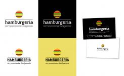
we find this a better option and we like the last 3 entries that you have submitted.
Here we particularly liked how our name was displayed. However, the burger symbol above, which is portrayed originally, resembles a bit the travel destination commercials. Any ideas how to twist it around?

This contest is finished. Its not possible to reply anymore.
logo_huisstijl-v-15022-66MlM8ci

No comments

This contest is finished. Its not possible to reply anymore.
logo_huisstijl-v-15022-4rjJkNqi

No comments

SandoriBVSandoriBV

can you transform this logo in vintage? or vector?

V.V.

Thank you for your feedback. I will make this design more vintage.
with kind regards,
Viola vd Akker

This contest is finished. Its not possible to reply anymore.
logo_huisstijl-v-15022-xRue5rAe

No comments

SandoriBVSandoriBV

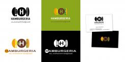
Dear V.,here's our feedback:
1. we like the use of H but we don't like how the patty looks like
2. the logo on green looks best in terms of color combinations

any other variations for this?

This contest is finished. Its not possible to reply anymore.