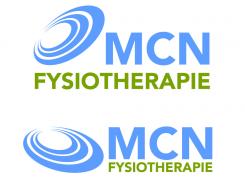
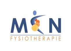
Design a new dynamic logo for a physiotherapy private practice in Amsterdam, The Netherlands.

Start date: 28-03-2013

Ending date: 02-05-2013

Total budget: € 449.00
Latest design
Book cover
feliz

It all started with an idea...

A short, interactive guide helped them discover their design style and clearly captured what they needed.

Needs


The logo should represent our values in an abstract, non-figurative, manner. Logo and corporate design will be used in print (letterheads, business cards, envelopes) and in our digital communication.

Company description


MCN has practices spread in Amsterdam Noord. MCN offers all specialized physical therapy and is a 'major league practice". Our aim is to consider all the different factors that play a role in giving bodily complaints to the patients. We team up with the patient and with our specialised collegues along with the referring doctors, to help the patient to a stable recovery. Keywords of MCN: 'in the best hands", personal, warm, passion for our profession, high standard of knowledge and best care for the patient.

Target group


-patients (of all ages, both men and women, multilingual with all the disorders that can be treated with physiotherapy) seeking for a practice that gives the best possible care in a warm and welcoming manner
-professionals in the care (doctors, specialists, dentists etc.)

Colors, favourites and other requirements


MCN and Fysiotherapie should be mentioned in the logo. The logo should be dynamic representing the various elements that are considered in our care.
Examples of the elements:
1 the patient with all the factors that are responsible for the bodily complaints
2 the patient - therapist relation as a team
3 knowledge and expertise of the therapists
4 close collaboration where necessary between the therapists/experts
These elements finally flow into each other to establish a strong and stabile recovery by means of the MCN Method.
No special wishes considering colours.
We don't want cliché type figures of hands, jumping body's etc. (that are commonly seen in logo's of physiotherapy practices).
What we want is a logo with MCN and Fysiotherapie in it. The logo should express the dynamic process of our treatments as mentioned above, in an abstract manner.

Designer: Simke Simke
logo-vizitkarte-memorandumi-dizajn-simke-83yP2pGK

No comments

SimkeSimke

Thanks for advices! Maybe you would like more this one. Regards!

MCNMCN

Comments here are that the C is not so clear for people who do not know MCN. Could you propose the C more like a C but with the three different shades you have now. Perhaps the dot on top could be left out. the circles a little smaller in shape and moving from red to a deeper and warmer yellow - sunlike color.

MCNMCN

And the words FYSIOTHERAPIE in a different front ... please suggest some options

This contest is finished. Its not possible to reply anymore.
logo-vizitkarte-memorandumi-dizajn-simke-Q9dZmUNc

No comments

MCNMCN

looks good, not exactly the nonfigurative idea we have and not really according to our tender in which we express that our mission and vision should be expressed.. but what if you leave out the right leg? And do you see an opportunity to state somewhere.... In the best hands? If not , no problem but try to simplify by leaving out the thin leg. Looking forward for your new trial!

This contest is finished. Its not possible to reply anymore.
logo-vizitkarte-memorandumi-dizajn-simke-PXJqybzc

No comments

This contest is finished. Its not possible to reply anymore.
logo-vizitkarte-memorandumi-dizajn-simke-JySLjiUa

No comments

This contest is finished. Its not possible to reply anymore.
logo-vizitkarte-memorandumi-dizajn-simke-npulu6FM

No comments

This contest is finished. Its not possible to reply anymore.