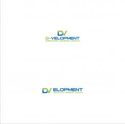
Design a new logo and corporate identity for D-VELOPMENT | buildings, area's, regions
- Contest holder: D-VELOPMENT
- Category: Logo & stationery
- Status: Ended
- Files: File 1, File 2, File 3
Start date: 22-07-2014
Ending date: 07-08-2014
It all started with an idea...
A short, interactive guide helped them discover their design style and clearly captured what they needed.
Brandsupply is a platform where creative professionals and businesses collaborate on unique projects and designs.
Clients looking for a new logo or brand identity describe what they need. Designers can then participate in the project via Brandsupply by submitting one or more designs. In the end, the client chooses the design they like best.
Costs vary depending on the type of project — from €169 for a business or project name to €539 for a complete website. The client decides how much they want to pay for the entire project.
Hi Ovfa,
Thanks for the new design, I appreciate your perseverance, but this is not what I'm looking for.
But thanks for your work,
Greets Dave
No comments
Hi Olva,
I like the logo, but it's similar to #43. I'm sorry to say, but I will not choose for this logo. I hope you understand that.
Maybe you can make something else?
Greets Dave
No comments
Hello,
Look at the design #43 and #27 !
http://www.48hourslogo.com/project.php?id=30007
sorry, I did not know before and I only use typography fonts, thanks
how do you think with this, thanks
Hi Ovfa,
Thanks, i like it! The first and second one are the best. The blue color is perfect, but the grey is a little too light. Can you show me some different grey colors?
Thanks,
Greets Dave
No comments
Hi Ovfa,
I like this color combination the most. Can you show me how this logo looks when you replace the DV for the D-V in D-VELOPMENT?
And in the subtitle regio's is spelled wrong.
Thanks,
Greets Dave
how do you respond, thanks
Hi Ovfa,
Thanks for the new design. Why are you using the red color?
The grey color is nice, although it's a little too dark. Maybe you can combine a lighter grey color with green and/or blue.
The shade is better now.
Greets Dave
Hello Ovfa,
Thanks for the new designs.The DV in DV now looks like an "O". In my first reaction I reffered to stretch up verticaly in stead of horizontaly.
Greets Dave
No comments
Hi Ovfa,
This design look good! I like the green and blue colors. But the shade is less attractive. Maybe there is an other way to create that. Perhaps a thin line is an option?
And can you send me some color options for the subtitle? Like blue, grey, and maybe some other?
Thanks,
Greets Dave
No comments
Hello Ovfa,
Thanks for your first design, i like it. Could you show me the first one with the DV on the upper half as a 3D version?
And is it possible to stretch up the D a little bit so it doesn't look like an O.
Thanks and good luck!
Greets Dave
 Nederland
 België
 France
 Deutschland
 Österreich
 International
