No comments
Design a new logo & CI for “Dukes of Data
- Contest holder: DoD´s
- Category: Logo & stationery
- Status: Ended
Start date: 30-07-2018
Ending date: 15-08-2018
It all started with an idea...
A short, interactive guide helped them discover their design style and clearly captured what they needed.
Brandsupply is a platform where creative professionals and businesses collaborate on unique projects and designs.
Clients looking for a new logo or brand identity describe what they need. Designers can then participate in the project via Brandsupply by submitting one or more designs. In the end, the client chooses the design they like best.
Costs vary depending on the type of project — from €169 for a business or project name to €539 for a complete website. The client decides how much they want to pay for the entire project.
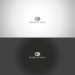
Hi niki,
thanks for another one.
This one is better then the first one, but it doess not hit the right strings so far.
The Ds are too generic, the dot in the middle seems a bit lost. Overall there are a lot of logos with the three letters and only very view does have a wow-moment for us.
But thanks a lot for your effort and your work,
cheers
joe
No comments
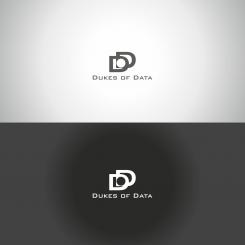
Hi Niki,
thank you for showing your work and your first entry.
Your choose of font is great, it is clean and simple and absolut readable.
Unfortunatly your grafic element does not wow us. It looks like DOD blurring into another.
However, thank you for your work,
keep it going and show us something more.
Cheers
joe form Dukes of Data
 Nederland
 België
 France
 Deutschland
 Österreich
 International


